Tian Zhao: My Kleros Fellowship Experience as a Digital Product Designer
The report of Tian Zhao, a UX designer and Kleros Fellow of Justice about his experience in cutting edge legaltech design.
My foray into the world of “B-law-ckchain” as a digital product designer (UX/UI/IX Design)
My name’s Tian Zhao and I’m a young professional with a background in industrial/systems/human-factors engineering from the University of Toronto who’s deeply and widely passionate about solving problems in a scalable, sustainable, and systematic manner. In particular, I’m incredibly interested in Industry 4.0 technologies such as what I’d like to call the “Computing Trinity”, which is divided into Cognitive (AI) + Connected (IoT) + Distributed (Blockchain) Computing. My mission is to apply design-thinking, exponential-thinking, and systems-thinking to optimize systems and processes in an effective, efficient, and expedient manner in everything I do.
November 2018, I was scrolling through my Twitter newsfeed and given my sheer love for the blockchain space, I happened upon this post by one of the companies I was following called Kleros.
Now, I’m a digital product designer and despite not seeing a track for design, I still ambitiously decided to reach out to them anyway. I initially applied to the cryptoeconomics track given its close proximity to the design discipline, however there wasn’t a fit for it. After a couple conversations however, they determined that they’d create a new track for me so that I can focus on digital product design (UX/UI Design/Research).
Why I chose this problem space of blockchain & law:
Why I chose to work with Kleros is because it was a great opportunity for me to learn and contribute more as a blockchain-focused product designer who’s passionate about social impact.
What’s incredible about all of this is that prior to encountering Kleros, I had no interest in law. Despite being told that I should become a lawyer when I was young (due to how much I loved to argue, I guess), I still had no interest in law growing up.
As I got older though, I realized one simple thing for myself as a designer — creating everlasting positive systemic change is the endgame for me and so, as long as I can achieve it through a scalable piece of technology and sustainable business solution, that’s all I care about.
Therefore, if it meant diving deep into a world that I never used to care about as much, then I would. I can now honestly say — legaltech and legal design are worlds that I’m incredibly fascinated with.
Legaltech innovation aims to revolutionize the legal industry, which has typically been considered conservative and resistant to change. New ideas, products, and concepts being developed in the field are trying to simplify complex law processes and generate more affordable and engaging solutions for end users.
Design represents a fundamental tool for promoting the changes that will benefit both lawyers, legal departments and individual consumers. By taking a design-driven approach to problem-solving, the legal system can be innovated in ways that were unimaginable in the past.
Kleros uses blockchain technology to rethink the justice system and propose solutions that can cause a positive impact on people’s lives. Decentralized applications (dApps) can help us propose a more efficient legal process by automating the enforcement of rulings through smart contracts, effectively reducing cost and increasing transparency.
-Excerpt from the book "Dispute Revolution - The Kleros Handbook of Decentralized Justice"
What is this challenge that Kleros is tackling?
Kleros exists because they wish to answer the following overarching question: how to design a system that produces true decisions at the lowest possible cost and in the shortest amount of time?
Given blockchain’s promise to truly democratize the internet as a whole, the founders of Kleros dug deep into the Greek legal system. The concept and etymology of Kleros and its core features was born from the following:
The Athenians had trials, which were conducted by a large body of ordinary citizens. On trial days, citizens wishing to serve as jurors went to the courthouse where a sophisticated jury selection procedure took place.
Each citizen inserted his pinakion (a bronze or wood ID token) into a slot of an allotment machine called kleroterion. After all citizens had inserted their pinakia, an official threw white and black icosahedron (20 faces) dice in a tube affixed vertically on a side of the kleroterion. The tube stopped at the bottom and held the dice in the random order in which they entered. Dice were then released one at a time. Candidates having a black dice on their row were dismissed for the day. Candidates with a white dice were drawn for paid jury duty (Boegehold 1995).
About 25 centuries ago, Athenians knew that courts could work as a peer-to-peer system without turning into mob justice, provided three conditions were met: jury duty was voluntary; jury duty was paid; jury selection was done by sortition (kleros).
Greek popular courts had no continuing existence or permanent personnel. They were decentralized organizations where jurors and officers changed from day to day following predefined rules[…]”
-Excerpt from the book:“Dispute Revolution — The Kleros Handbook of Decentralized Justice.”
These core features are therefore:
- a native token called “Pinakion” (abbreviated as PNK);
- a voluntary P2P system of jurors and plaintiff vs. defendant without a judge; and
- a randomized jury selection process based off of the “Kleroterion”, which of course is the source of inspiration for the name “Kleros” altogether.
From this overarching question, they came up with the following overarching goals for Kleros as a whole — to build an optimal cryptoeconomic model for user engagement that is:
- Efficient — does it incentivize users to arbitrate cases privately?
- Effective — does it incentivize users to to arbitrate cases commutatively?
- Ethical — does it incentivize users to to arbitrate cases impartially?
Kleros is hoping to address the following macro-challenge:
Ultimately, they hope to positively affect change in this area, as well:
Process
Project Scope
Product Timeline (inclusive dates): 4 months Part-Time Pro Bono (Jan. to April 2019)
Product Platforms: Web
Product Type: Legal-Tech
Product Status: Early-Stage & Bootstrapping
Product Background: https://kleros.io
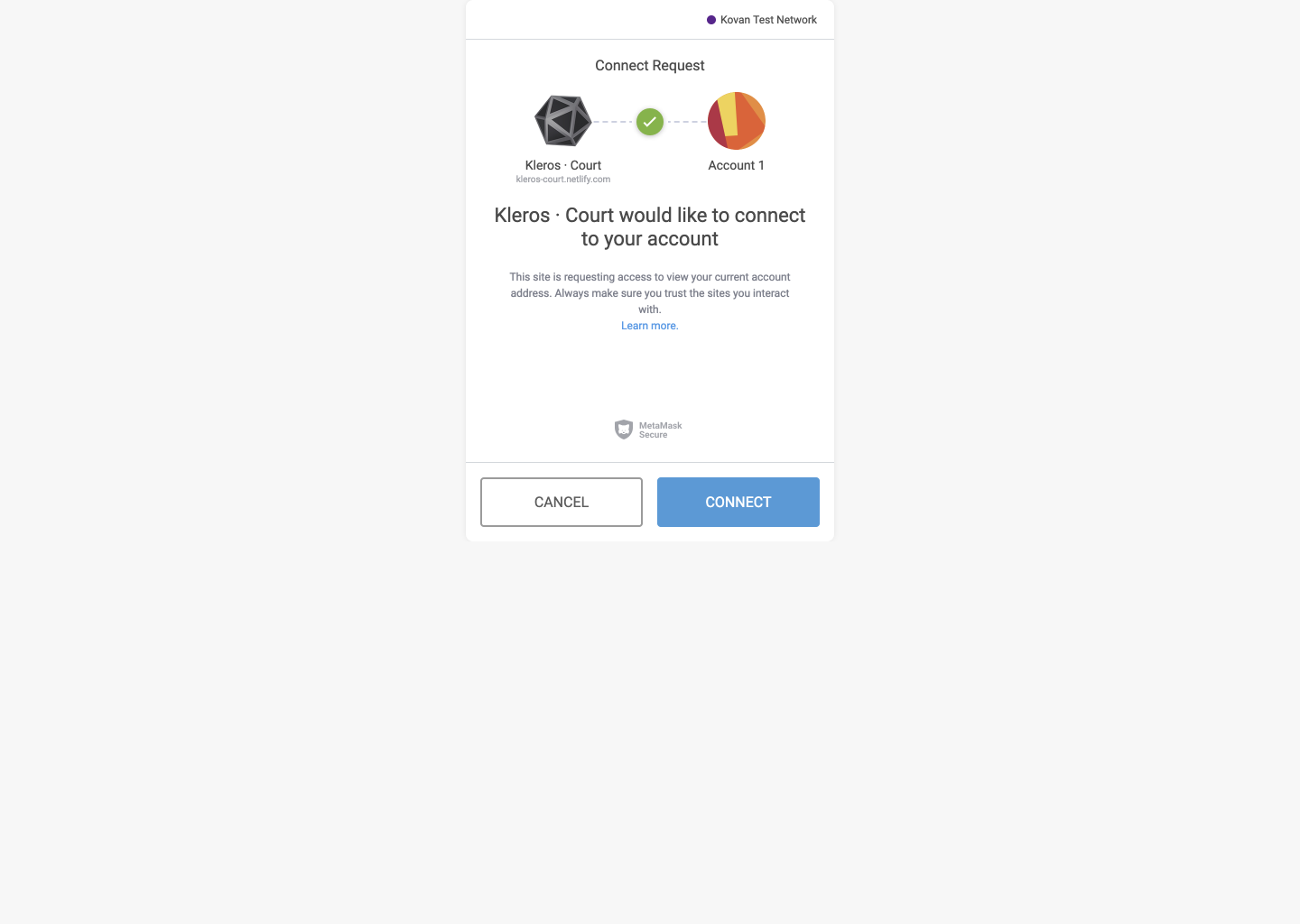
During the beginning of this project, I was provided with much ambiguity, given that I was simply tasked to “improve the UX” of the following product:
Kleros Court AKA the Athena release, which is an online portal that allows users to join as a juror and to be randomly selected to adjudicate disputes in various subcourts.
After spending a considerable amount of time researching the problem space some more, I came up with the following goals, to drastically & dramatically improve:
- The Onboarding process
- The Court Selection & Staking process
- The Case Arbitration or Dispute Resolution process
And by “drastically” and “dramatically”, I mean for each of these 3 components to be noticeably better for the user wherein, the ultimate goal for them is to become a juror so that they can (help) resolve digital/online disputes. Therefore, the final iteration should allow users to have minimal-to-no confusions regarding what they have to do & why they have to do it w.r.t.:
- Approaching a Case
- Accessing a Case
- Arbitrating a Case
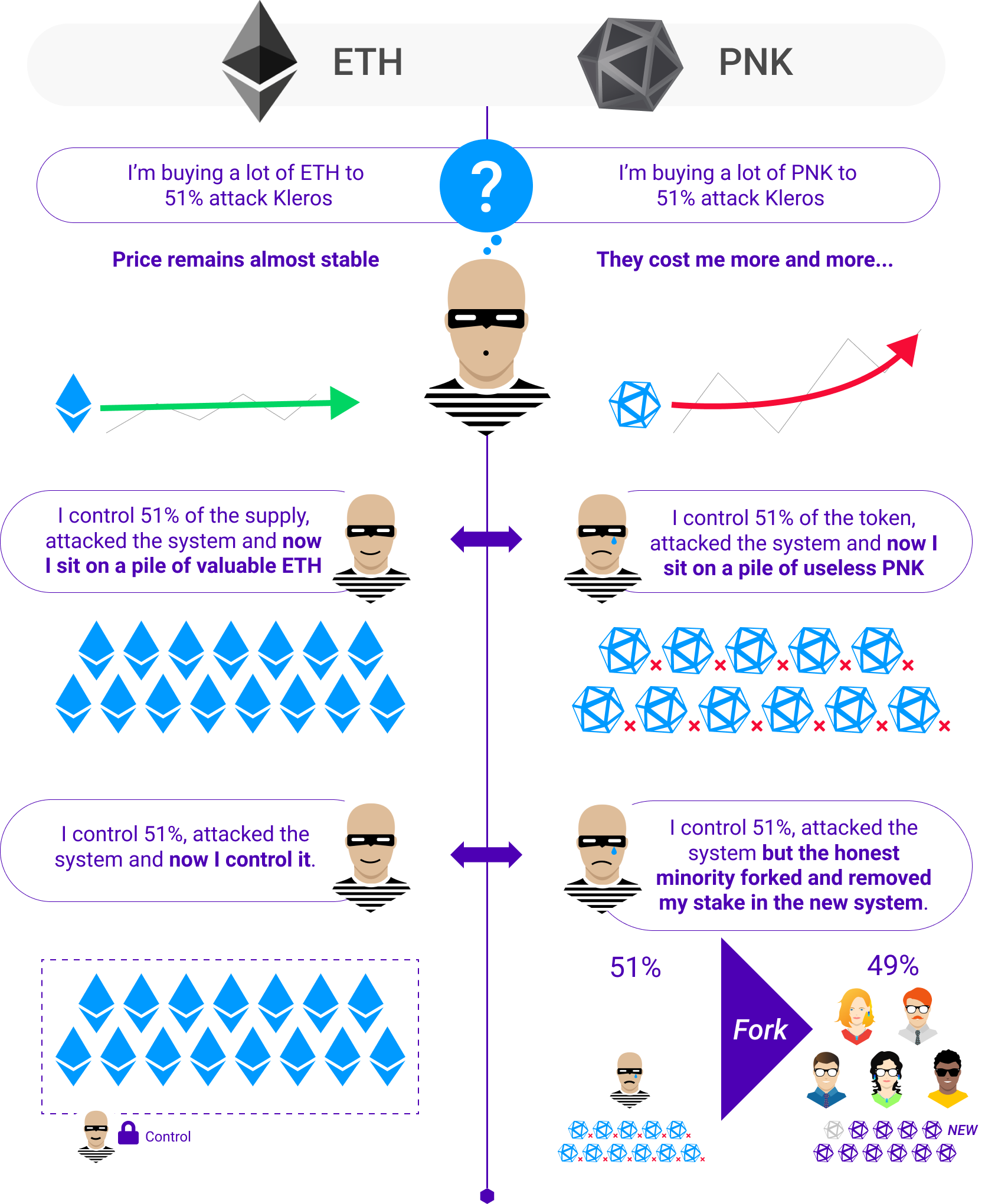
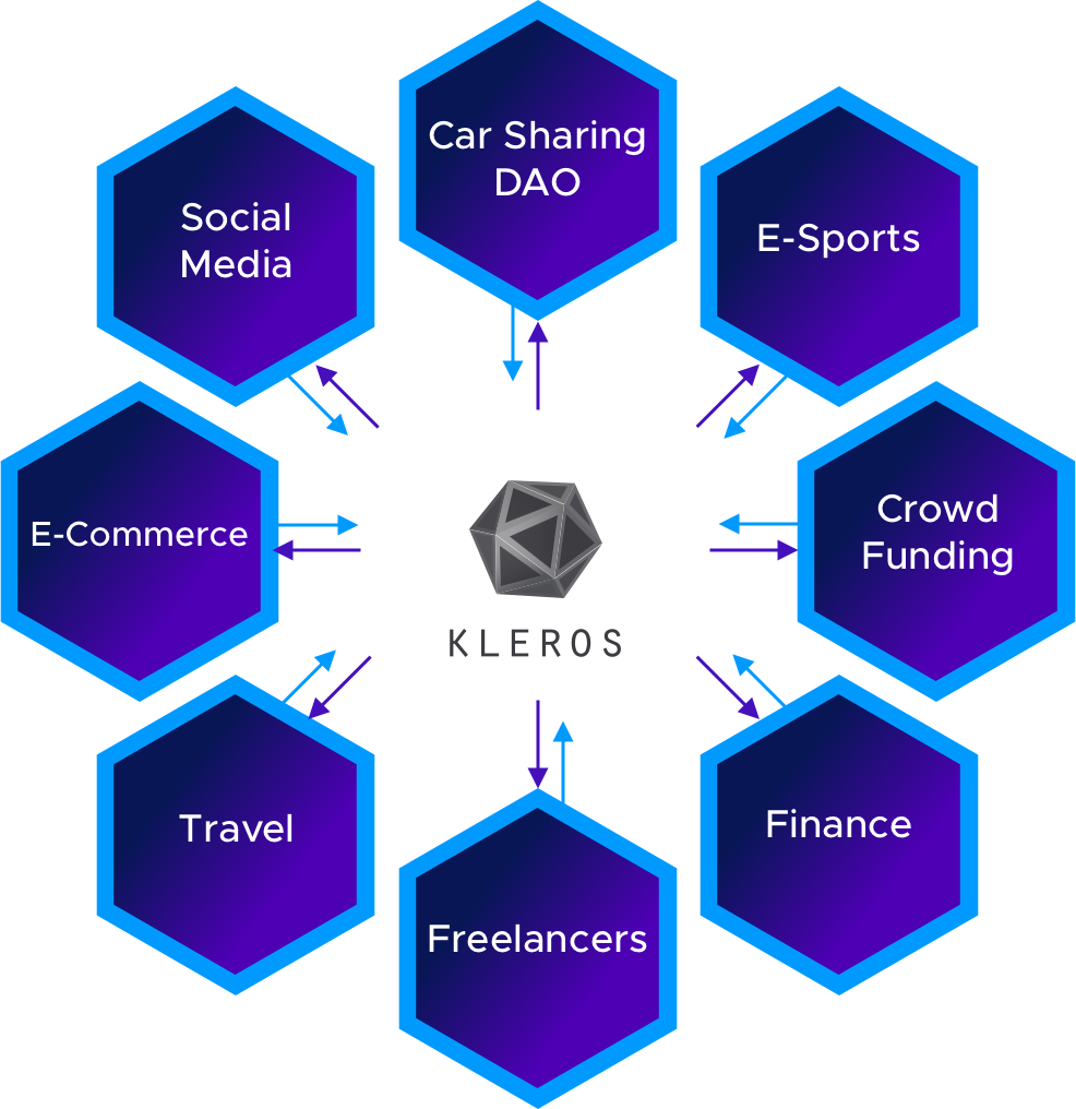
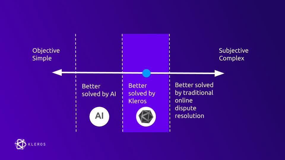
All the while, I should ensure that the design adheres to the design principles emergent from the blockchain backbone and why it’s there as well as the legal industry and its requirements. Before I share my design principles, I must explain share one simple infographic explaining why Kleros needs a native token and what it’s all about:
Project Guidelines:
The aforementioned design principles I decided to adhere to are the following:
- Wisdom of the Crowd & Privacy — this principle is all about being respectful of people’s data whilst empowering them to feel like they’re a part of something larger than themselves.
- Fairness & Trust — this principle is all about being bias-free because “justice is blind”, after all.
- Transparency & Truth — this principle is all about being as concise, yet comprehensive with the information provided so as to establish professionalism, dignity, and modernity.
Project Constraints
- The company is located in South America and I was the only designer in Toronto working on this
- The company does have one lead designer, but his hands were tied for the most part dealing with a lot of other design work.
- This did, however, make it easier for me to focus on my work since it meant that I would be given more autonomy with it.
- In addition to this, though, was the fact that overall, because the startup was in its early-stage and bootstrapping, funding was limited for me.
- Therefore, we couldn’t do highly-quantified data-driven user research due to inaccessibility to such software.
- Moreover, I was limited in time due to juggling a full-time job at the time at RBC as a design researcher there; as well I have a long daily commute of about 2 hours roundtrip.
- I did both the initial scoping and iterations, usability testing and analysis, as well as final iterations and project wrap-up.
Project Activities
- Reading several articles published by Kleros, Stanford Law School, and Civic Hall Toronto on the subject matters of legaltech and legal design to better understand the Kleros ecosystem. In essence, I sought to understand the problem space more and to basically put my head in the game of what the Juror Product was trying to be.
- I applied a mental problem-solving technique known as MECE — to conclude that initial research step to determine what my Happy Path would/should be.
- Formulating a survey based on all the above readings.
- Applied standard digital product design principles such as the "10 Usability Heuristics for User Interface Design" by the NNGroup to conduct an initial iteration based on the Figma prototype provided to me by their lead designer, Plinio Braga.
- Recruited several legal practitioners with a curiosity for futurology at a hackathon run by the Toronto Legal Hackers group as well as several young professionals.
- Tested my first iteration with said young professionals, conducted a second iteration, then tested that second iteration with the legal practitioners.
- Conducted analysis on all the feedback provided
- Designed a few more iterations.
- Synthesized everything into this article.
- Overall — I applied the technique of the Happy Path to focus the scope of my work.
Project Research
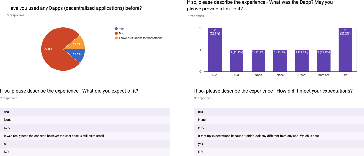
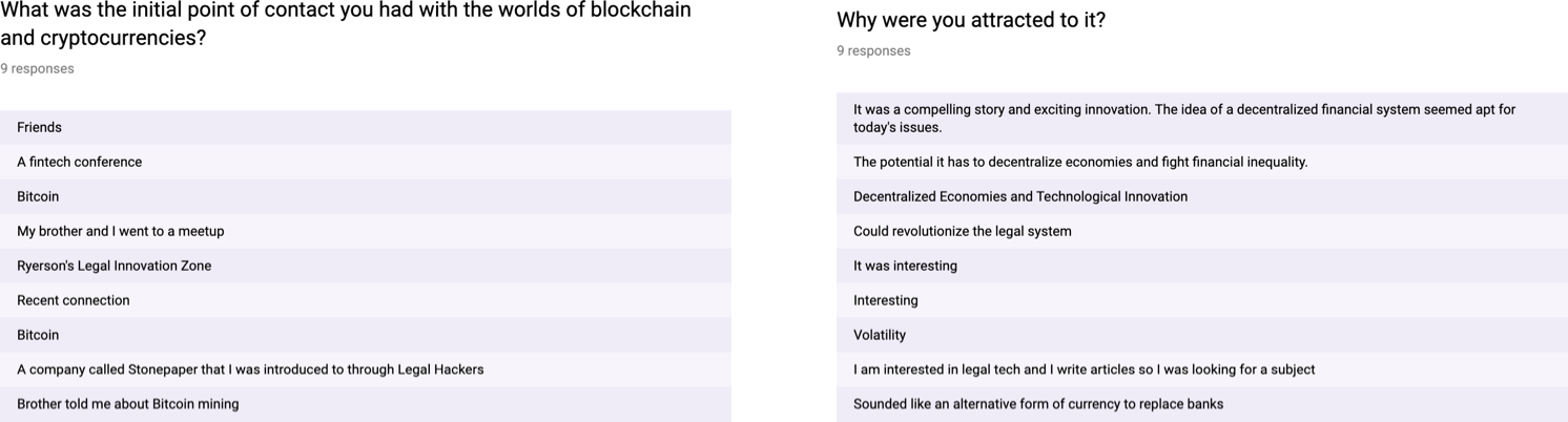
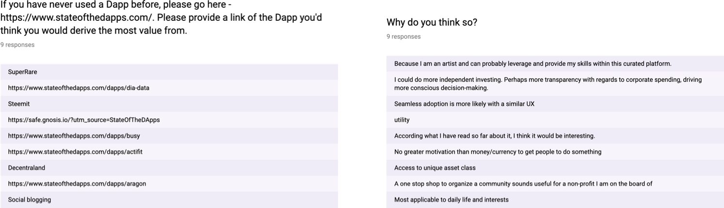
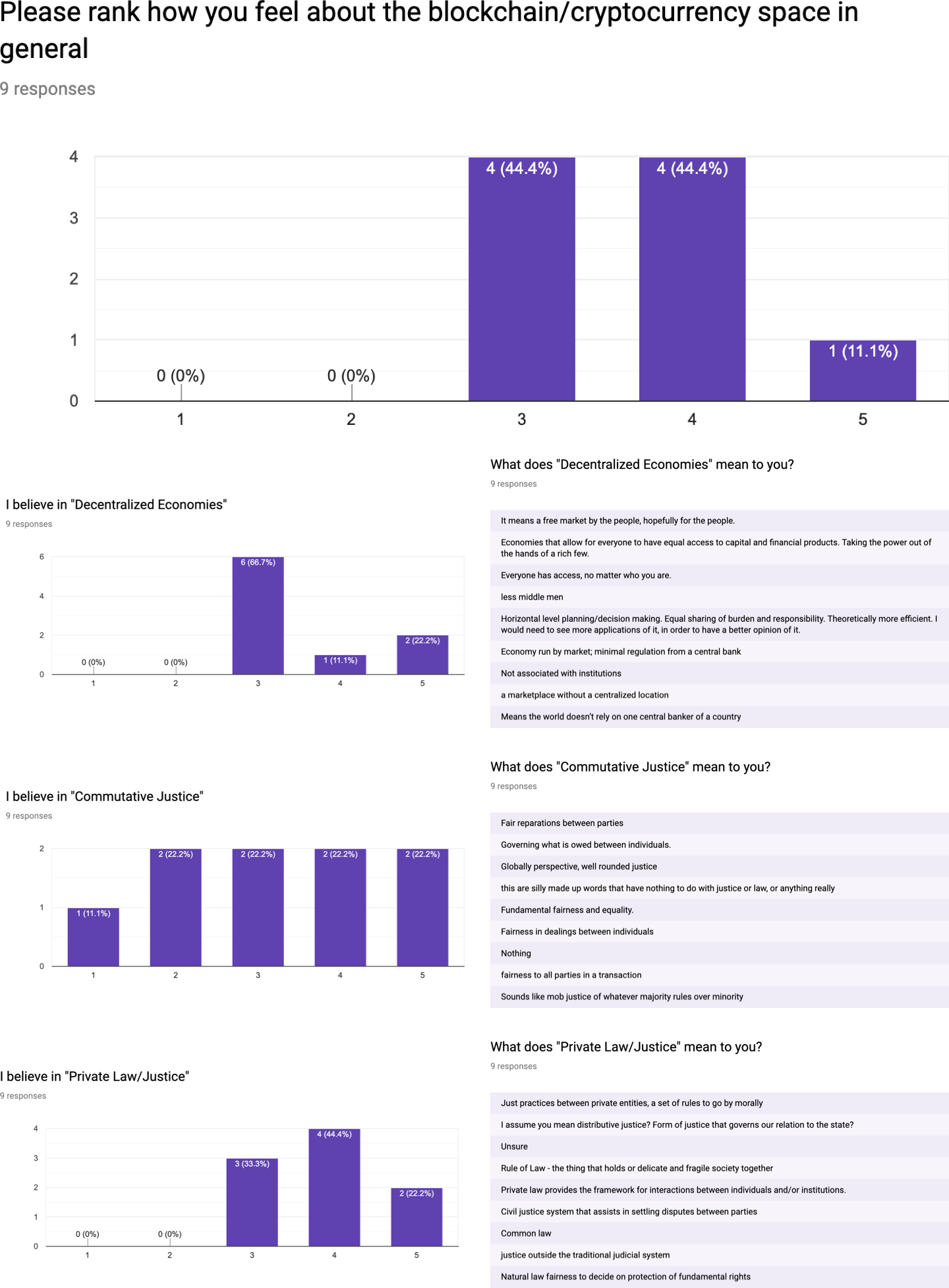
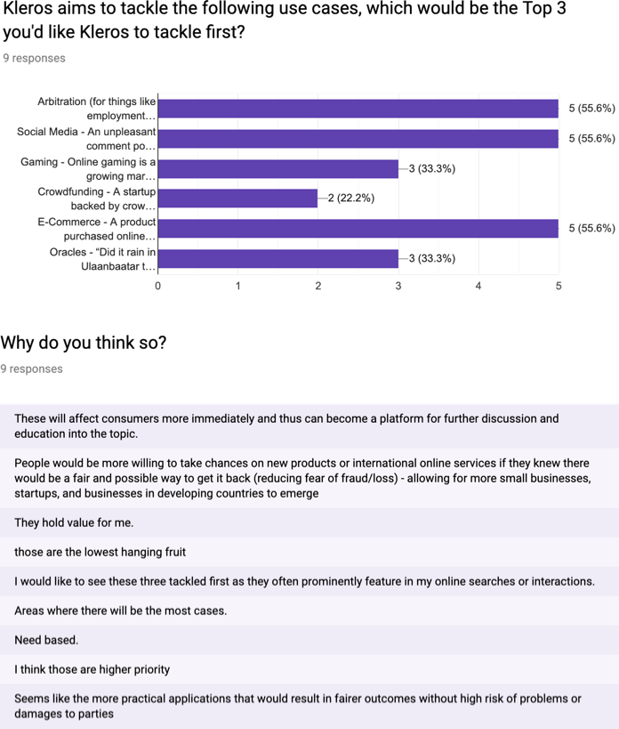
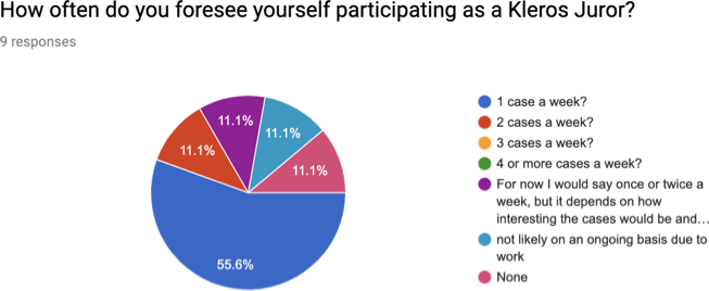
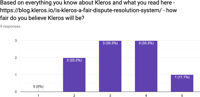
The following are some highlights/samples of the survey I had conducted, where I was able to assess 9 different individuals:
Product
Visual Design
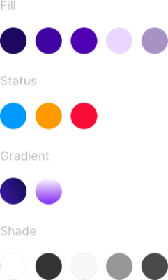
Below are some visual elements that are commonly used throughout. I didn’t have enough time to rethink these, but if I did, I would’ve used a different typeface and created additional illustrations. As it stands right now, the only main change I made was standardize the colour palette because previously/originally they had upwards to 10 different shades of greys and purples. I had to standardize that down to the following. This was still hard to work with, but more manageable and if I had more time I would’ve reduced the amount of purple shades to 4 instead of the current 5.
Roboto was the chosen typeface used throughout.
This was the colour scheme used throughout:
This was the main illustration used in variations.

Product Journey
“I want to be a juror, arbitrate a case, and win rewards.”
This is the Happy Path the team and I set out to optimize on.
The following describes the main tasks a user would have to undergo in the DApp.
Join as a juror via email invitation:
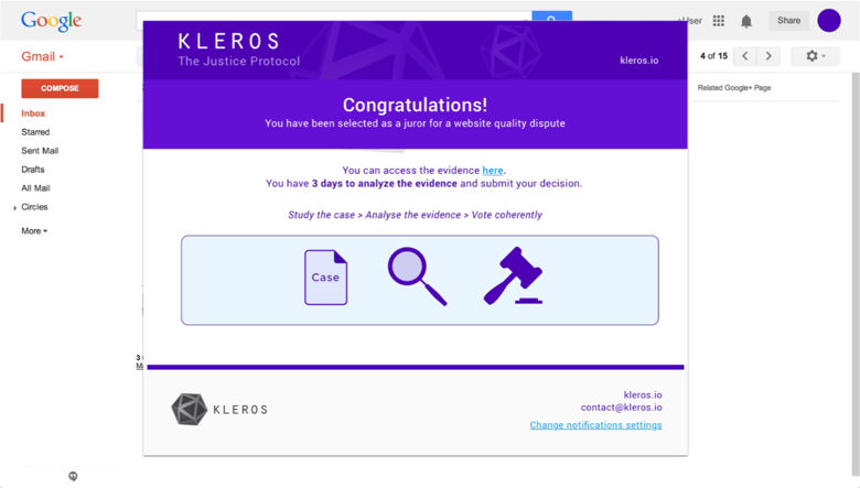
Once they hit the “here” hyperlink, they’ll be taken to court.kleros.io. From there they:
- Choose a court where they will have the competency to arbitrate.
- Stake PNK to a chosen court in order to be selected as a juror.
- Wait to be selected as a juror and/or indicate they’d like to be notified via email.
- Upon being randomly selected as a juror for a case: they’ll come back to Kleros and enter the same chosen court as before.
- Choose a case to arbitrate.
- Analyze case evidence.
- Make a decision as to who they think deserves to win — plaintiff or defendant.
- As a consequence, the juror can win rewards in ETH and PNK, or lose staked PNK, depending if he/she voted coherently with the majority or not.
Product Design
Below are before and after shots of key screens and UI elements during/within the aforementioned Happy Path.
Nomenclature
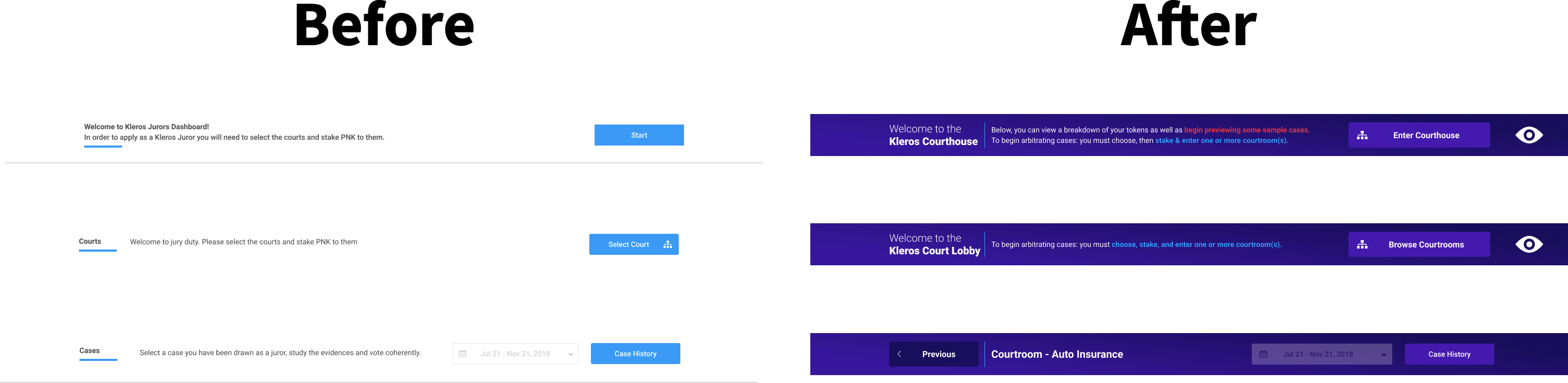
Courthouse, Court Lobby, and Courtrooms:
You’ll notice that my final iteration contains only two of these words. Based on my testing, I found the initial nomenclature to be highly confusing for several users including myself even. “Courts” and “Courtrooms” for example meant the same thing to those with a legal background. Though, for those who may not be so familiar such as myself — I though a “Court” meant the whole “Courthouse” and “Courtrooms” meant a “Subcourt” for example. I felt that the term — “subcourt” despite being used profusely initially was confusing — given that no such term exists in the legal space and could be perceived the same as “court” and “courtroom”. Therefore, I’ve chosen to create a new set of terminology wherein:
Courthouse supersedes Court Lobby, which supersedes Courtroom.
The Courthouse houses the entire court as a whole which consists of a hub-and-spoke model where the hub = Court Lobby and the spoke = Courtroom. The Courtroom contains all cases that belong to it. So, for purpose of consistency, I’ll be using these 3 words as opposed to the original terminology.
Another change I made was to make the “Courtrooms” tab a dropdown. I did this as a way to conceptually merge “Cases” and the previously entitled “Courts” together. Now, if someone clicks on “Court Lobby” dropdown (which will be the default that’s selected), they can see all other courtrooms they’ve joined. They can try clicking on each of them to enter into them, but if they either haven’t staked them or weren’t chosen as a juror for them, they won’t be able to actually click on it. A tooltip should then popup to inform the user as to why. This way, the user is “always being onboarded” but subtly.
Navigation

I removed “Cases”, “Governance”, and “Guides” because the latter 2 were superfluous to this MVP (Governance belonged in its own product whilst Guides would’ve just been FAQs and is usually tucked away elsewhere).
“Cases” was confusing given that users are required to stake their courtrooms first before entering it to view them. Having separate tabs for “Cases” and “Courtrooms” didn’t make sense because it broke the information architecture of it all.
The logical progression is to join a courtroom, stake in a courtroom, then enter it in order to view cases, decide which one to study, study it, and then make a decision as to who deserves to win the case — plaintiff or defendant. The IA is one of an in-series sequence of events as opposed to parallel movement.
Therefore, I simplified it to illustrate the “hub-and-spoke” model I mentioned previously. As for “Tokens”, it was separated out as a CTA button for the purpose of calling it out as a unique action that could occur in parallel to the main course of events.
Sub-Navigation
The sub-navigation before needed a revamp because previously it was airy-looking and didn’t instil confidence in its instructive text as well as its CTA buttons. Now there’s both consistency as well as boldness in terms of how the sub-navigation looks and what it says in the different pages.
Swimlane
This is a crucial element and will stay consistent throughout most pages so as to keep the users constantly updated as to their PNK count. Visibility of System Status is the reigning design principle that I’m adhering to for this. It provides a visual reminder at all times how much they own, stake, and the amount locked, since Kleros has redesigned the legal practice of arbitration to become a transactional activity.

The original Swimlane lacked consistency in terms of its' visual design. Additionally, I removed the Etherscan address as well as the Ether amount due to how overwhelming it would be for the user. Monitoring 1 token all the time was daunting enough as it is. Ether does show up elsewhere in the Courtroom Cards but has more meaning there.
Courtroom Cards
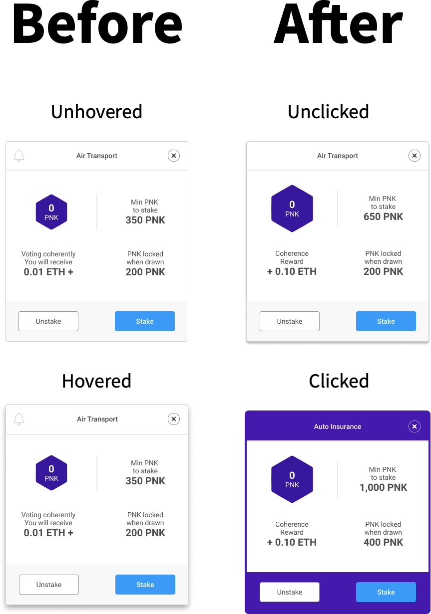
I removed the bell icon because users weren’t sure what it was for. If we want to keep users notified about when they’ve been drawn as a juror, we should simply ask them once if they wish to be notified globally for all courtrooms and that can be done elsewhere.
I expanded the diamond to account for scalability of the number within as well as to place emphasis on it. I made the “clicked” state bolder because that’s the only way to reveal the bottom action bar. This is to account of the in-series UX of the overall navigation that the previous design didn’t have.
Case Cards
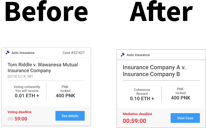
I removed the case numbers because that denotes judged cases not arbitrating cases. I increased the ETH count because 0.01 was demotivating. I spruced up the visual design a bit to adhere to my grid as well as removed all real world names so as to adhere to the bias-free design principle.
Onboarding
The original contained zero onboarding, save for reading materials beforehand. I’ve decided to include not only a typical onboarding that contains spotlights, but also a “preview-mode”. The preview can be toggled but only before the user actually joins and stakes their first courtroom. The preview allows the user to eventually view case details but not arbitrate it.
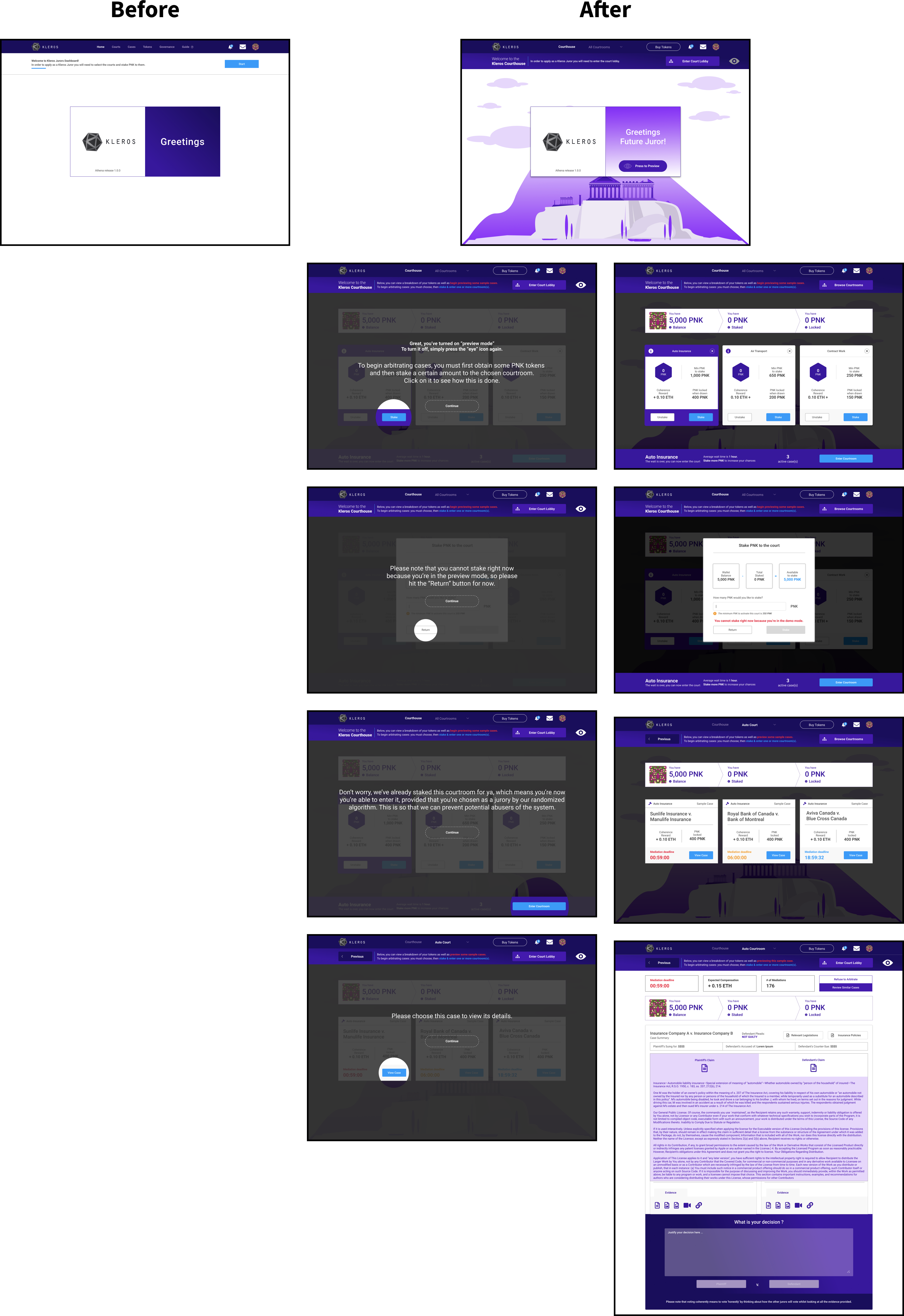
Most existing DApps require purchase of their native token beforehand. I thought to create this preview as a way for users to peer through the window before opening the door as opposed to simply being told to enter it by a realtor.
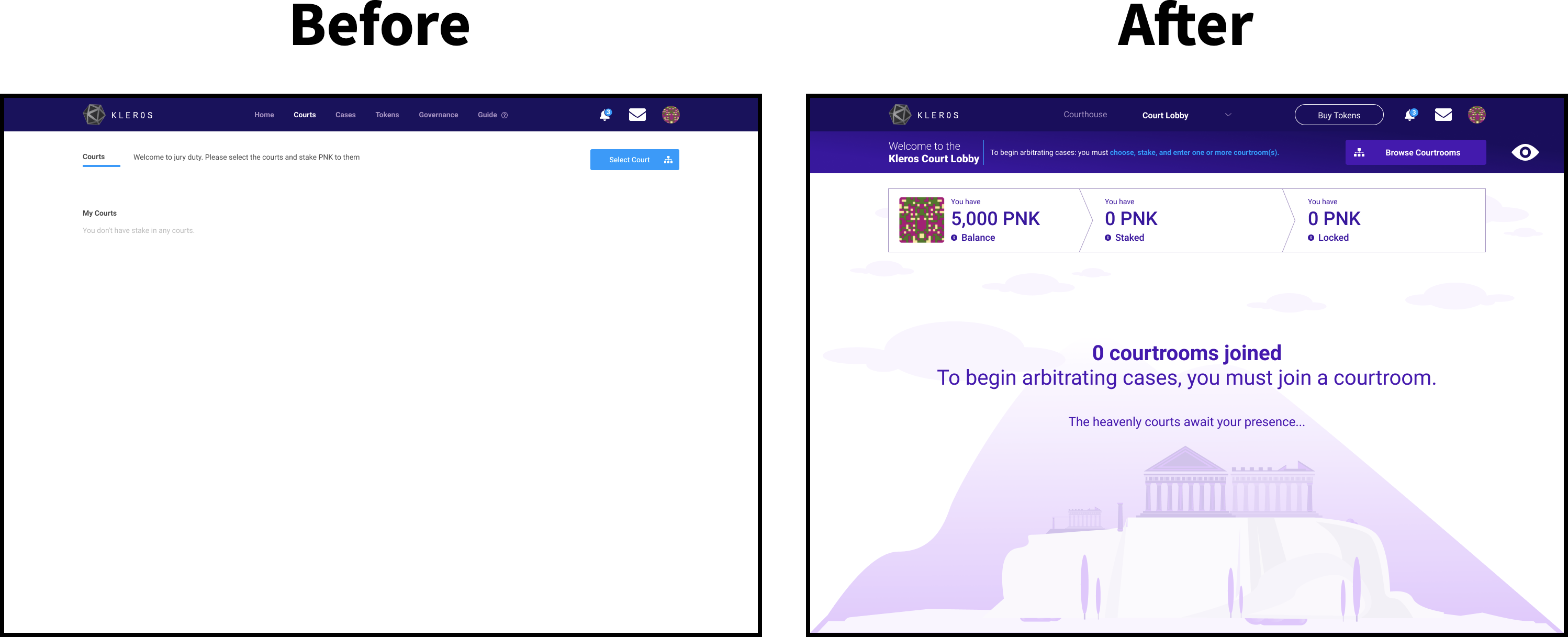
After the user has decided to click “Browse Courtrooms” they’ll be taken to the “All Courtrooms” page. The original empty state screen is instructive but that instructive text is very unnoticeable and overall screen is uninviting. My proposition would be for the empty state to be modernized with with an empty state illustration. This empty state no longer feels weak and removes all confusion as to what the user should do.
Court Selection
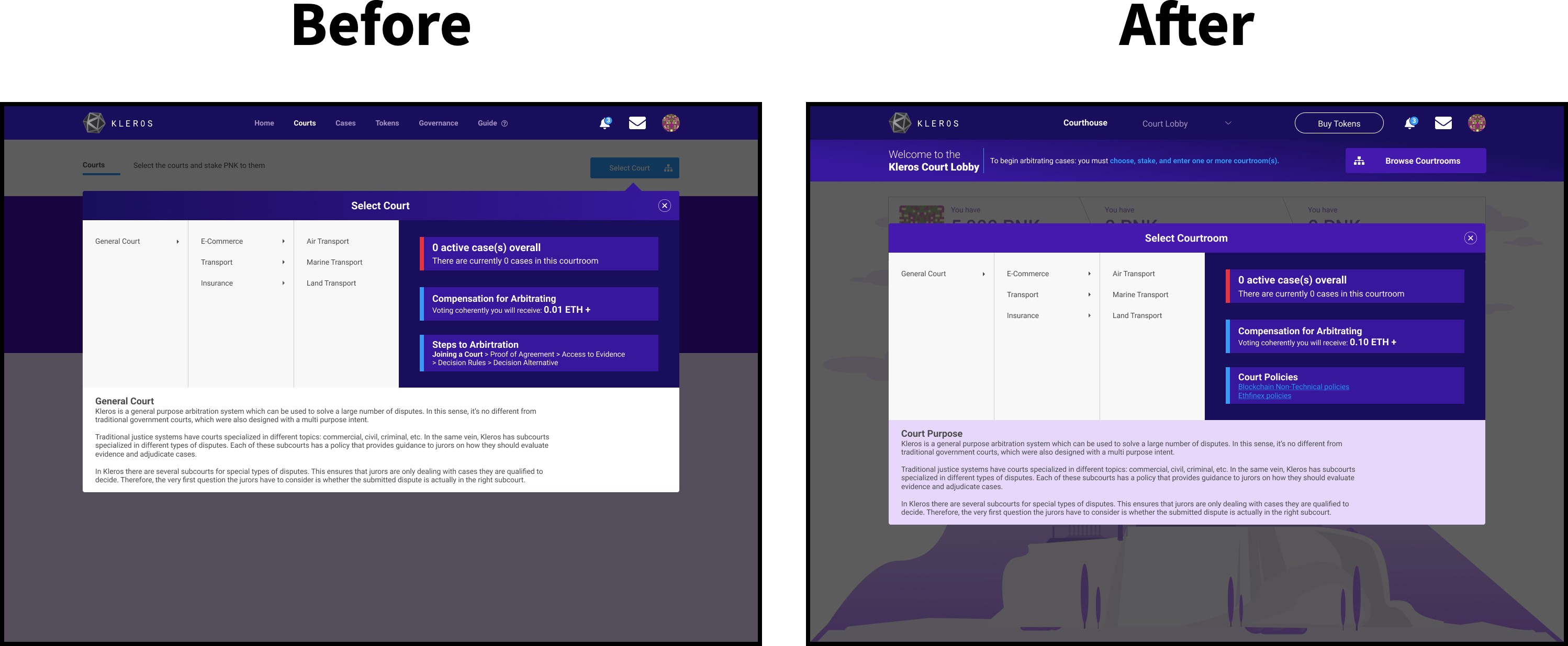
Court Selection didn’t change much, due in part to a lack of time to rethink this, but also due in part to the technical constraint that I felt was placed here. The code for this navigation is more complex than most other UI elements in this Happy Path and I didn’t want to tamper with that.
Typically a screen like this might look more akin to an e-commerce browsing page given their similarities in how there are courtrooms within courtrooms, akin to e-commerce categories and subcategories. However, there is good reason for this design, because e-commerce has to be highly visual so as to drive purchases, the world of Justice on the other hand cannot be as such.
Therefore, this has to be text-based so as to remove biases, however if I had enough time to update this, I’d use more iconography and recreate this page to look more similar to something like this infographic with concentric circles signifying courtrooms that supersede other courtrooms. This way it’d stay neutral, but be enticing at the same time.
Court Staking
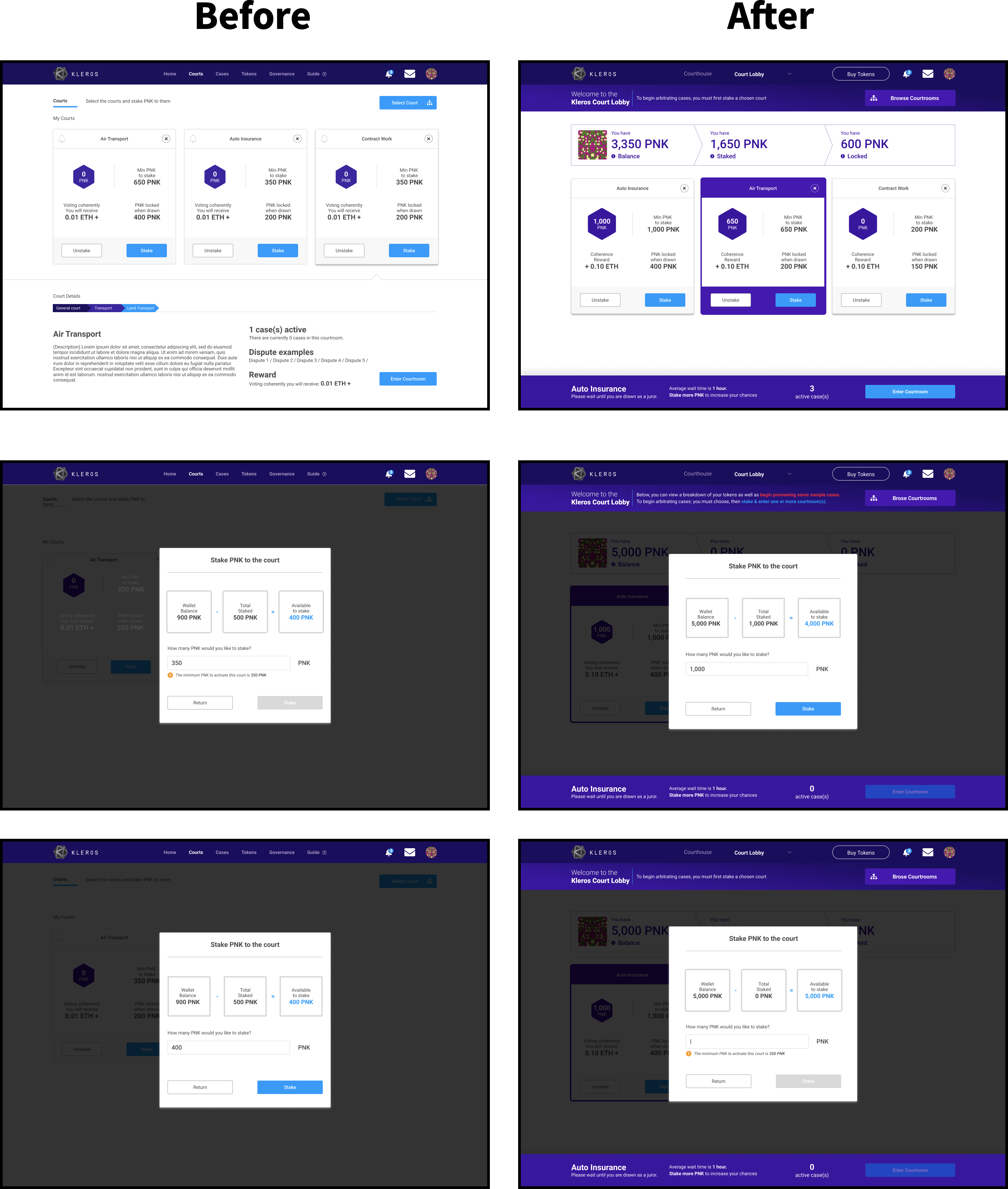
Apart from integrating the aforementioned UI elements of the Subnav, Swimlane, and Courtroom Cards, I introduced the bottom Action-Bar as a way to address the overall in-series UX of Kleros. Visually, it also makes it look like a house given that the user is now within the Courthouse — with a top and bottom enclosing the user in. This makes them feel safe, secure, and have confidence to know where to go next. The other key thing to note here is that at any given time a Courtroom Card will be automatically selected as default because previously this wasn’t the case.
All Courtroom Cards could be deselected. Also previously there wasn’t a metric updating the user how many active cases there were and additional instructive text notifying them about the average wait time as well as why staking more PNK mattered.
Entered Court
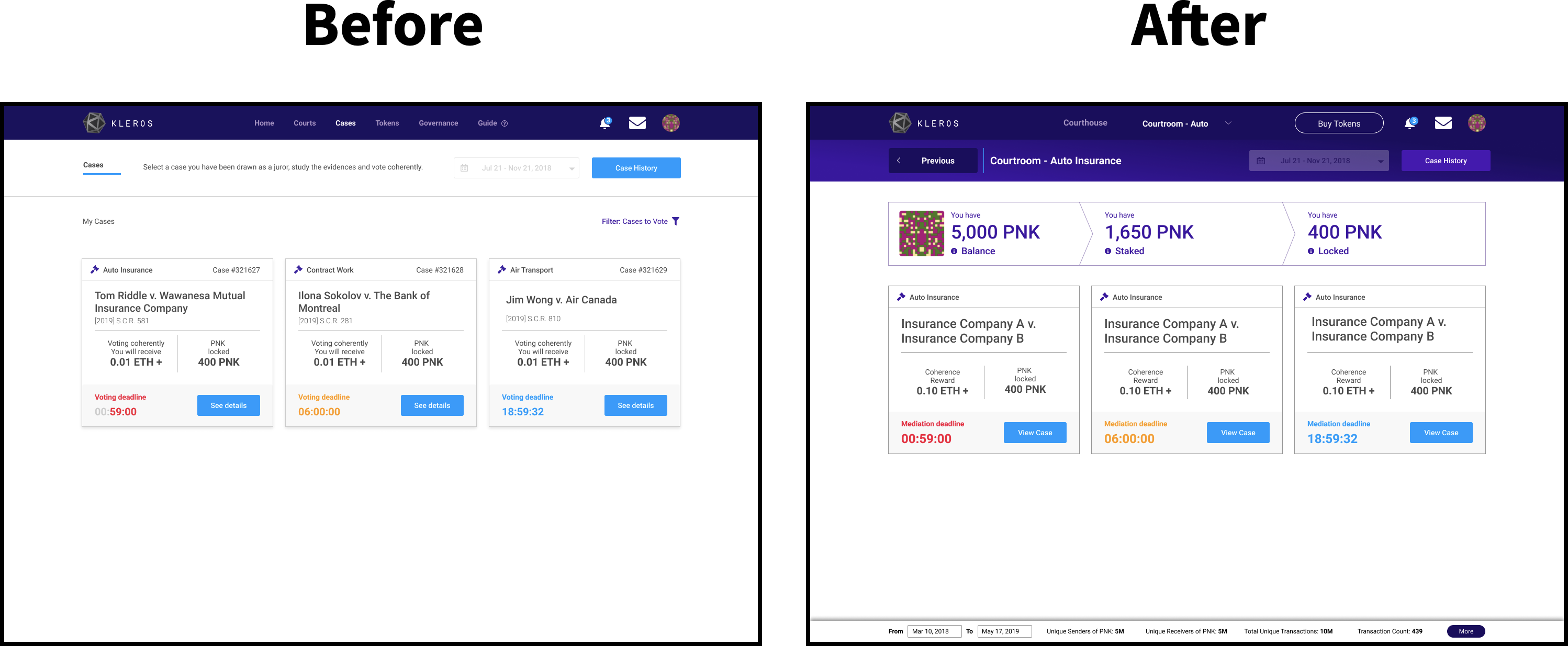
Apart from integrating the aforementioned UI elements of the Subnav, Swimlane, and Case Cards, I introduced another new element to play. This time, a small thing, but an important change that will only show up are in the cases pages — both all cases and within a case. This is to signify to the user that there are other users who are arbitrating, thus enabling a sense of “I’m a part of something larger than myself.”
This horizontal bar will be tentatively called the Community Lane so as to keep in line with the “community” aspect of blockchain as a whole. When I tested the initial design with users, they all asked “is anyone else arbitrating?” They wanted to know that their actions weren’t the only ones affecting change in the system since that would help them feel their actions mattered.
This Community Lane is also my signal to the blockchain community as a whole, to say — that something like this needs to be more thought out and standardized across all DApps. What do I mean by that? I’ve always held onto the notion that DApps differ from regular Apps because since it’s supposed to give “power back to the people” or data back to the people so-to-speak, then it’s up to the DApps to provide data analytics for them.
Therefore as designers: data analytics, science, and visualization is a key element to a great user experience in this space. Despite this Community Lane not being a “visualization”, it’s just an initial move towards that, hence its minimalist design.
Currently, DApp developers love showing raw numbers straight from Etherscan, thinking that it’s enough to give insight to users. This is why I tried my best in this regard by only focusing on a few pieces of data with key info such as “sender” and “receiver” amount for each case and all cases might help instil a sense of “Wow, there’s some serious activity going on here! Okay, I guess I’ll put my PNK in since others are clearly doing it.”
I’m not going to bother with “total volume” and other metrics that only investors care about because the goal here isn’t to motivate Kleros Jurors to invest in PNK, but to simply use it for a greater goal and to earn more money of course for themselves. This is why this data needs to be re-represented, repackaged, and reframed for the user so as to provide inspirational insight and promote encouragement in their decision-making.
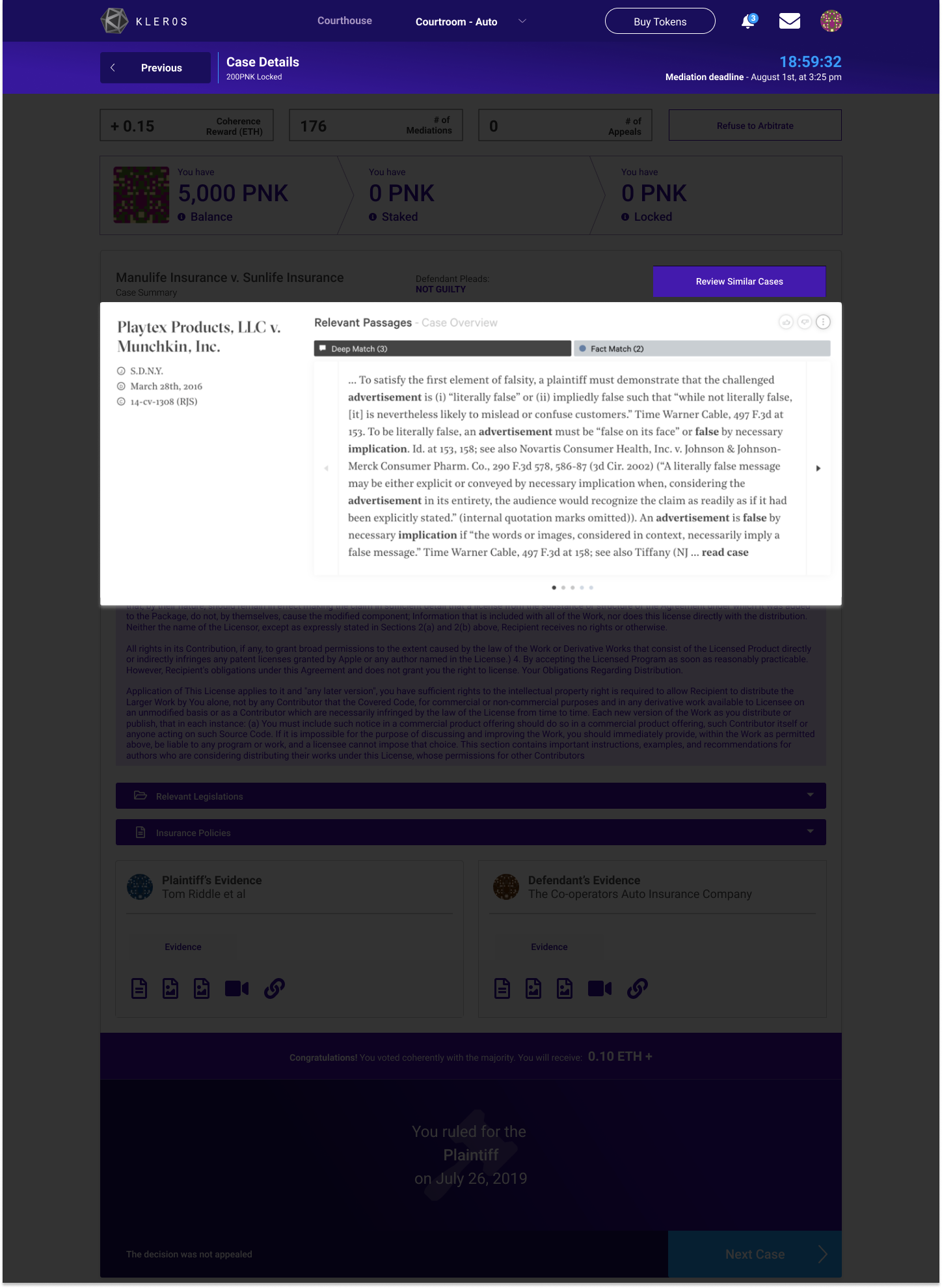
Arbitrating Court Case
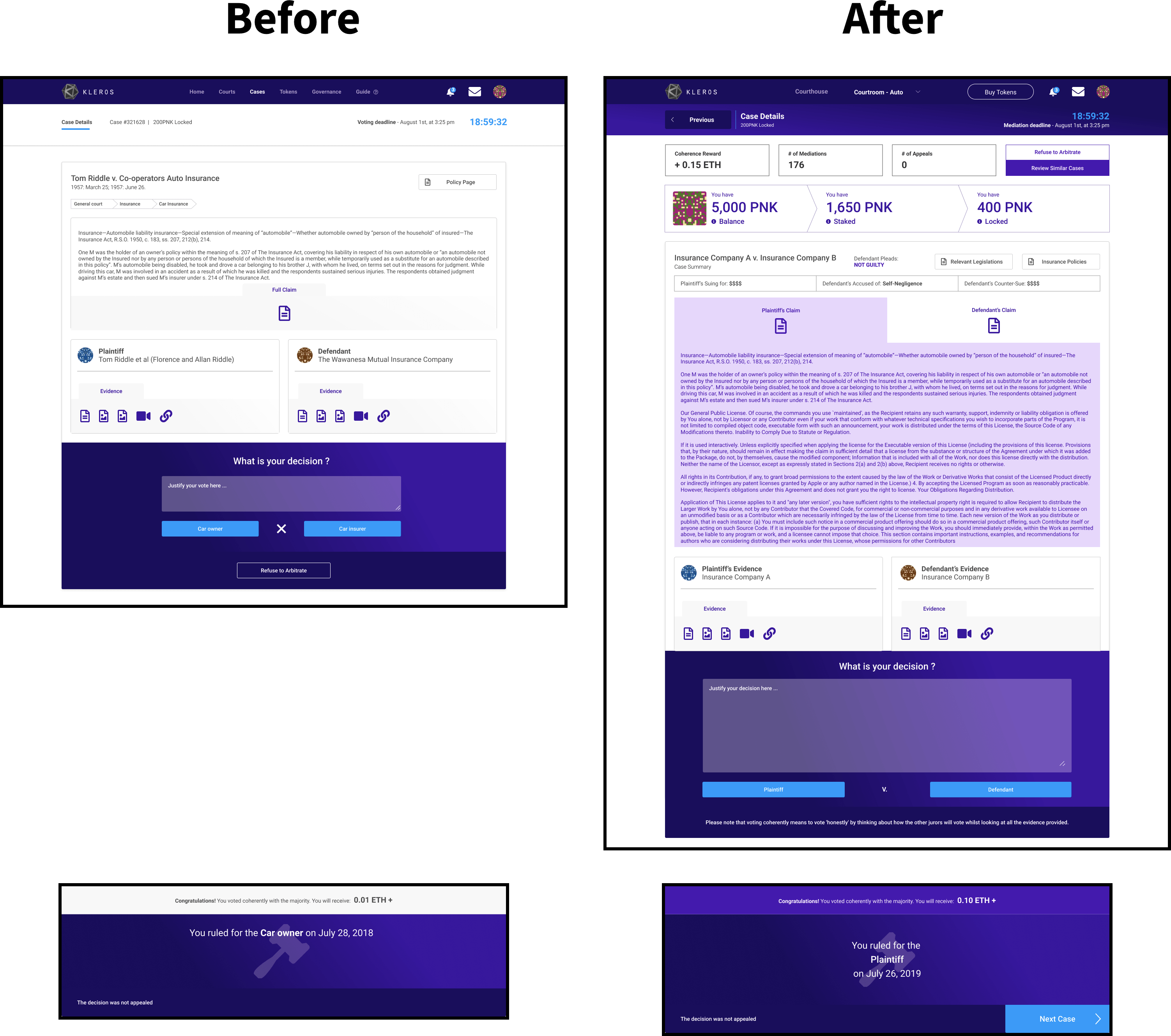
Arbitrating a case changed a lot here because this is the crux of the Happy Path, this is why users are here at all. One of my research participants said that this was his favourite page and he was the passionate litigator who always takes his time to optimize his work. All legal practitioners I tested with said had the most to say about this screen.
The main takeaways I got were that this page needed more information, as well as more space dedicated to both the case brief as well as the case feedback sections. There also needed to be an unbiased look into this, whereas prior only the defendant was highlighted, here the defendant and plaintiff are equally represented. Key actions and metrics are now up top in the subnav as well as the area right below it.
Key additions are as follows: Legislations, Policies, Plead, Suing for, Accused of, and Counter-Sue. These were all considered to be incredibly critical pieces of information or areas of knowledge that without would make the arbitrating UX a pain given that the user would have to search elsewhere for relevant legislations for example and might not feel as motivated to arbitrate if they weren’t sure what the user was pleading and doing about their case.
There’s a lot more to be said about this page and that could be done to improve it even more, but these key changes I felt were necessary for the MVP.
Onboarded
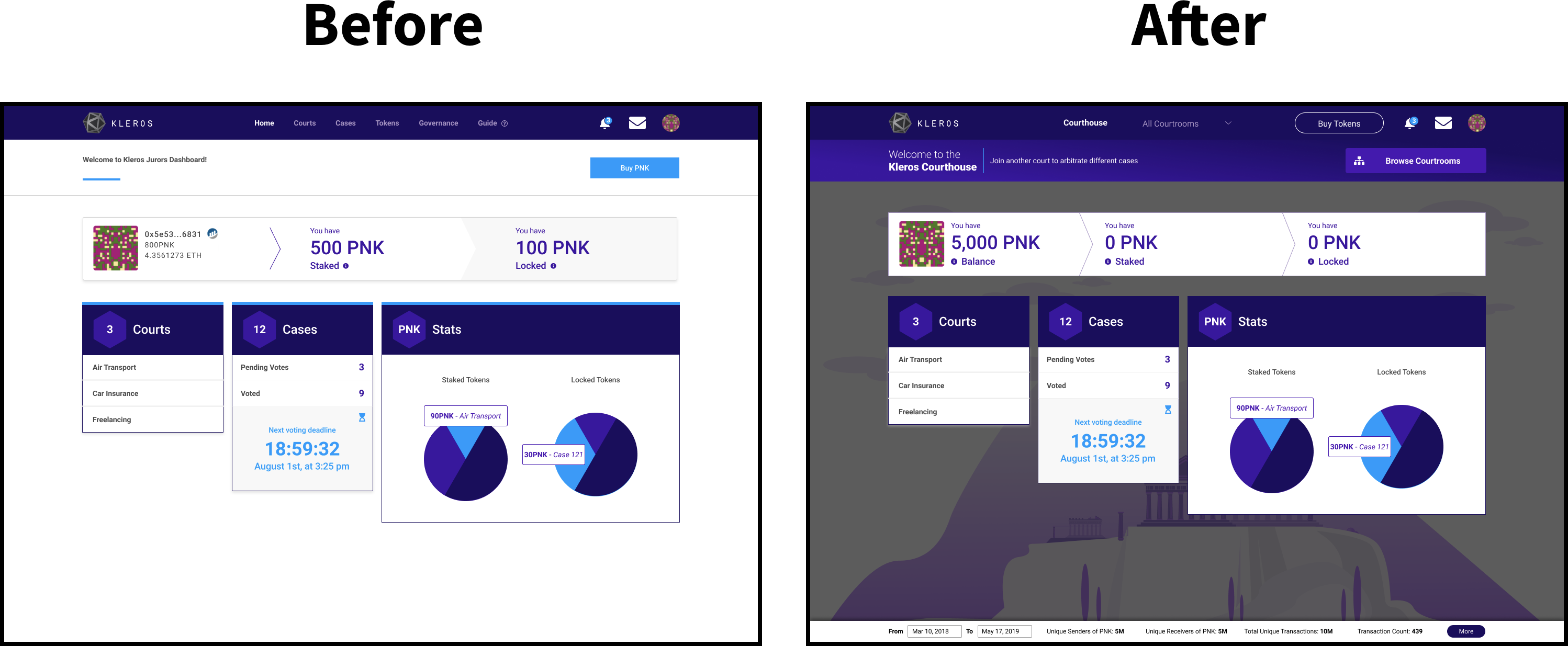
Now that they were onboarded, the new Courthouse page would simply be more dashboard-like. the background illustration was maintained so as to keep a sense of visual appeal. Key thing here to note is that the original design had the dashboard UI in its pre-onboarded state. This iteration ensures that users only see this dashboard UI when it matters, after they’ve become fully onboarded.
You can find the final prototype of the fifth iteration here.
Testing & Analysis
The following is the synthesis of all the testing I had conducted into Miro, where I was able to assess 6 of the 9 that I had surveyed:
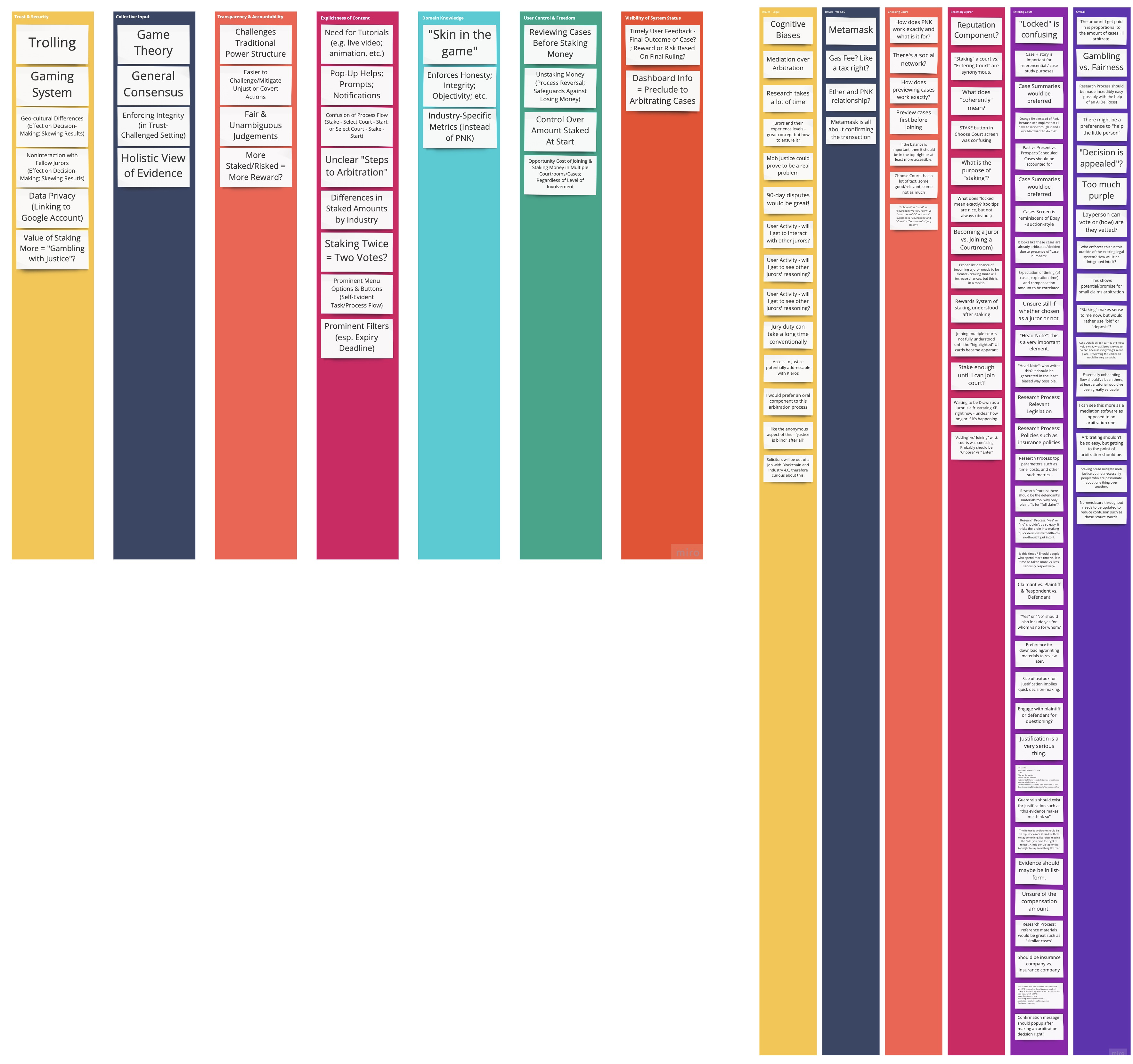
The buckets of information created were both conceptual/principle-based as well as Happy-Path-based. The left Miro board denotes a synthesis of user feedback bucketed under common design principles such as “Trust & Security”, whilst the right Miro board denotes a synthesis of user feedback bucketed under the main steps within the Happy Path.
Project Insights
- Blockchain transforms all-tech industries into fintech. The reason for this is because it shifts the paradigm towards a hyper-transactional one. Therefore as a designer in this space, we must at the end of the day ensure that each transaction that they make reflects a 100% confident decision.
- Blockchain transforms law into a more accessible space and therefore we should do our best to match the system to the real world whilst easing users to a brand new world. Therefore as a designer in this space, we must at the end of the day ensure that any/all legal information presented reflects fairness, truth, and justice without confusing anyone.
- Blockchain transforms how we onboard our users, since DApps don’t own user data, or at least they’re not supposed to. Therefore, I propose the way DApps should onboard is one of allowing them to essentially have a window-shopping type experience, one of previews, demos, or simulations. This is because as mentioned above — blockchains transforms all -tech industries into fintech. When something like “money” or digital money comes into play, it’s a very sensitive subject. The problem with most DApps nowadays is that they by not allowing users to demo the true experience, you’ve essentially designed a paywall into your system without even trying or meaning for it to happen. By forcing users to use a native token, you’ve automatically designed a paywall. Additionally — if you cannot own user data, then you cannot easily populate any recommendations for them by collecting any relevant user data you may need at the beginning. Therefore, if you don’t allow for previewing — you’ll only be forcing them to log into an empty husk. At the very least, this is where empty state design must look exquisite.
Final Thoughts
What I would do differently or more if I had more time and resources?
- Drastically and dramatically improve the PNK attainment happy path. What this means is to focus on how we might better motivate users to attain PNK in the first place?
- Drastically and dramatically improve the PNK staking procedures for the courtrooms. How might we better motivate users to stake PNK into existing courtrooms given that this still might feel a bit like gambling? At the very least how might we better inform users as to what staked and locked mean?
- Drastically and dramatically improve the Case Arbitration procedure — i.e. the Case Details page/screen/UI. I already have a big idea — to use AI-driven measures. What do I mean by that? During testing, users commented how “Man, the return on investment for spending all this time studying this case seems quite low given that I would have to spend about a week to study this and am only potentially earning a maximum of 0.10 ETH?” This means, we have to optimize this for them. One sure-fire way was when I asked them if they knew about Ross, an AI software that streamlines the research process for lawyers. The legal practitioners I tested Kleros with all said unanimously — “Yes, that would be heavenly, if we can also use something like Ross or Ross itself, then that would make this so much better.” My proposition would be as an MVP — we can break up the case brief into bite-sized chunks ourselves by forcing the defendant and plaintiff to enter their case details in bite-sized chunks. A long term goal would either to build out an internal AI-engine or integrate/partner up with companies such as Ross Intelligence. Additionally, if I had more time on this page, I’d redact and/or replace all real-world names with the more neutral-sounding “Party A” vs. Party B”.
To learn more about Ross and how it can drastically/dramatically improve the legal research process, please check this out.
See the implemented changes as of September 2019 here!
Looking ahead…
Kleros is one of the few Dapps out there that I believe has the earnest of intentions for what they’re doing in this burgeoning space. I’ve been asked before multiple times and I’ve heard this intent uttered a lot — “Why are Dapps better than CApps (Centralized Applications)?” I can bore you with all the knowledge-based or factual reasons as to why DApps and not CApps? I can even provide a SWOT analysis. Despite all of this and in spite of my personal love for this space and belief in all its potential — I still had a hard time fully grasping (“to understand something intuitively or by empathy”) why DApps over CApps?
However, as of recently I’m able to now break it down from an emotional perspective — this debate of centralization vs. decentralization all comes down to this:
Since time immemorial human beings have made decisions based on predictions which form expectations as well as a whole Pandora’s box full subjections — emotions, feelings, notions, perceptions, thoughts, etc. In other words — we as human beings have always made bets on everything we do.
What does this have to do with anything? It all boils down to a similar dichotomy that is analogous and sits at the parallel of this centralization vs. decentralization debate. This similar dichotomy is one between artificial (AI) vs. collective intelligence (CI). Now you might say to yourself — “well this still sounds like a whole lot of factual mumbo jumbo to me”. And you are right.
What if I told you — that by using a CApp, you’ve made a bet. You didn’t just make a harmless decision, but you made a future-state predicting bet. That bet is one where you’ve chosen Artificial Intelligence over its counterpart — Collective Intelligence. Now, you might be wondering — “Hey, I’ve heard of the terminology of Big Data, ‘Wisdom of the Crowds’, and other such terms such as ‘crowdsourcing’ and ‘crowdfunding’, what do you mean I’ve placed a bet on AI over the human collective?”
Yes, Kickstarter for example has really “kickstarted” this whole “Wisdom of the Crowd” concept, despite being CApps themselves. However, what I mean is that at the end of the day — “the zenith of what a CApp can become is the most artificially intelligent software at whatever it is that they do with whatever data that they have of you.”
Conversely, the zenith of a Dapp is to be the most collectively intelligent software at whatever it is that they can do with whatever data you have for it. This is at the foundation of what a Dapp is, it’s meant to create a highly intelligent software alright but by the collective, of the collective, and for the collective. To learn more about this dichotomy from the perspective of Kleros — I encourage you to read this article.
This is really at the crux of what this is all about, why all of this matters, and where this is all going. Kleros presently sees itself as sitting at the intersection of pure AI vs. pure SI (based on the “singular intelligence” of, from, and by an individual). The way I see it however is that AI, CI, and SI are all 3 equal sides of a holy trinity of intelligence. I argue that as much as CI sounds great and all, all 3 are equally important, necessary, and beneficial.
This is why I argued for using AI as an assisting force and integrative tool earlier when I mentioned Ross Intelligence (a CApp that is all about providing legal assistance to lawyers). The way that Kleros can go about doing this from a near-future state perspective is perhaps to have the following design for their case details page (with relevant legal documentation that is AI-analyzed):

Where Can I Find Out More?
Join the community chat on Telegram.
Visit our website.
Follow us on Twitter.
Join our Slack for developer conversations.
Contribute on Github.
Download our Book