Developing the Kleros UX Strategy and Plan
As the Kleros ecosystem consolidates, tracking and analyzing Dapp performance is becoming key. See what methodologies we employ to improve overall user experience.

How we defined Kleros design process by combining the best of popular methodologies.
As a cross-functional blockchain team, Kleros has been constantly delivering new DApps that intend to address some of the major legal problems of the internet age, with a bold purpose to make legal solutions more accessible, trustworthy, and less bureaucratic for everyone. As a result, we plan to go beyond our releases and also improve our internal UX processes to achieve a higher level of efficiency.
In this article, we start exploring the Kleros UX strategy and plan, discussing the process and methodologies we use to achieve our goal and the next steps planned to deliver the best user experience to our customers and community.
Kleros alignment with Lean UX principles
In 2013, Jeff Gothelf and Josh Seiden published a book called Lean UX: Applying Lean Principles to Improve User Experience. Its principles resonate with how we work at Kleros, which involves simplifying the processes, delivering an initial version or MVP fast, learning from users’ feedback, then incorporating the feedback as improvements, repeating the cycle.
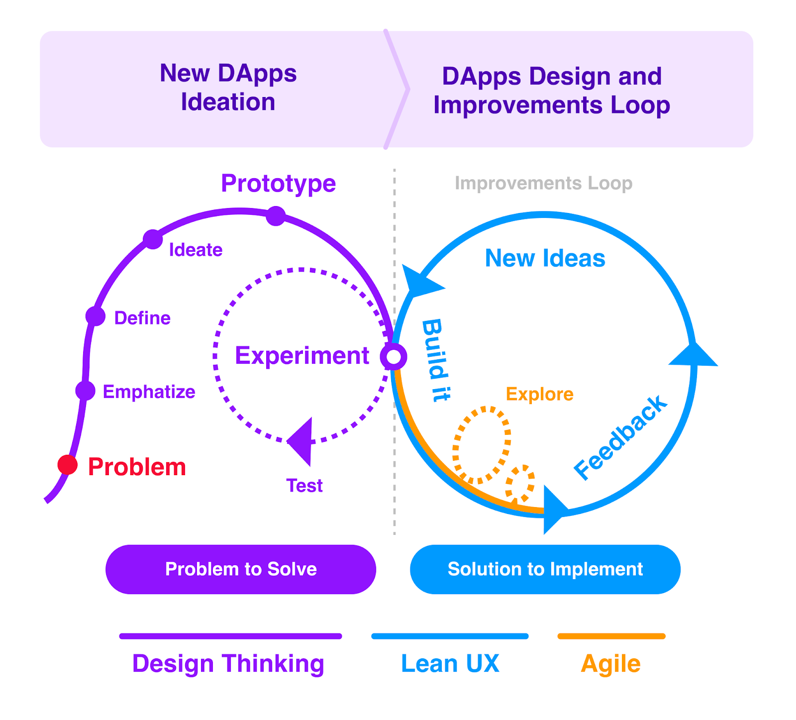
The design process we aim to perfect at Kleros has 2 major phases. First, the ideation of new DApps which involves the Design Thinking methodology and Stanford Legal Design practices to explore a problem and propose a solution based on real user needs.
Second, the use of Lean UX methods to design and build the solution promptly, learn from real users through rich feedback, and propose updates to improve the product. The last part repeats again and again like a loop of constant improvements, always based on data we acquire in the process.
The key concept we incorporated from the Lean UX methodology is the purpose to build and release the initial version to be tested by real users ASAP, which assures we start receiving real users’ feedback earlier, basing our following design on data-driven decisions.
“Lean UX is about bringing the true nature of a product to light faster, in a collaborative, cross-functional way that reduces the emphasis on thorough documentation while increasing the focus on building a shared understanding of the actual product experience being designed.”
― Jeff Gothelf, Lean UX: Applying Lean Principles to Improve User Experience
That combination of methodologies has proven to be the best approach according to our company characteristics: small size cross-functional team, solo design work, high-tech blockchain environment, and business needs to deliver the products in a shorter time.
Of course, that’s not a rule to be followed by everyone, we are just sharing the practices that work best for our own context. Actually, we encourage everyone to combine existing methodologies to extract the best of them according to each phase and context.
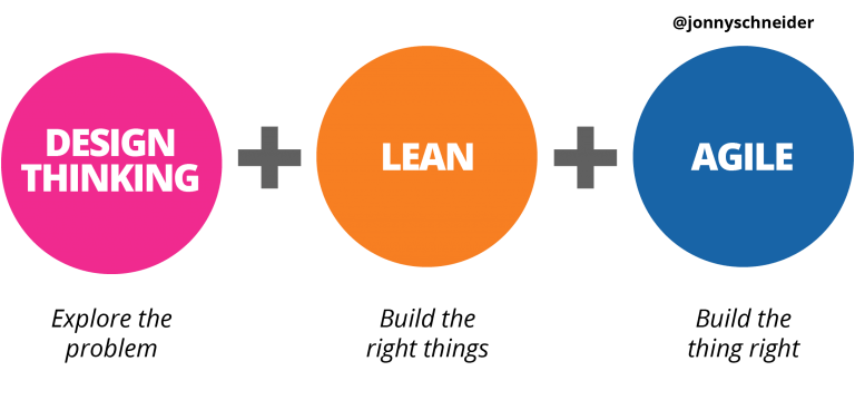
“Design Thinking is how we explore and solve problems; Lean is our framework for testing our beliefs and learning our way to the right outcomes; and Agile is how we adapt to changing conditions with software.” - Jonny Schneider
Users’ Feedback: The key to success
As you might have noticed, the feedback received from our product users is a key element in our process working as an electric force that moves our products towards its goal. Users’ feedback is vital both to validate ideas and concepts, and to feed us with rich data used to make improvements, fix some issues, clarify some possible pain-points and keep the wheel running towards the fulfillment of user needs and satisfaction.
As a key element in our process, it makes it important to find more efficient ways to facilitate users’ feedback acquisition, to track KPI’s and measure the evolution of our products’ user experience. For that reason, we plan to start incorporating in all our products an in-product feedback system, which will capture contextual feedback from our customers in real-time.
Implementation of an in-product feedback system
The goal of implementing a feedback system is structuring and automating the feedback acquisition process, KPI tracking and general feedback directly from the DApp UI, which may be set in the following steps:
- Definition of the strategy and KPI’s to track, as well as metrics to evaluate adoption and retention depending on each product context. (NPS, 5-star ratings, Google HEART, number of users completing a specific task, etc.).
- Choice and setting of the tools to be used.
When the system is set, we plan to start processing the feedback received:
- Monthly analysis of the feedback received in each DApp.
- Production of Findings Report (UX Report produced to gather the results of a specific user test or research).
Data-driven decisions
By pursuing the goal to feed ourselves with rich data and feedback about the users, we also plan the implementation of analytics to track general metrics like the number of people reaching (opening) our DApp monthly, geographic regions and languages used, percentage of users that open the DApp in Web or mobile devices, and general metrics that may expand our knowledge about Kleros users. The results will be evaluated monthly and included in the Findings Report as well.
“If a measurement matters at all, it is because it must have some conceivable effect on decisions and behavior.”
—Douglas W. Hubbard
User Testings
In addition to in-product feedback acquisition and analytics, we also plan to be more involved in the conduction of qualitative and quantitative user testings like usability tests, A/B tests and other tests depending on the context and hypothesis to be tested with representative users. The user tests will be conducted in order to validate specific assumptions, brought by users’ feedback or by the team, and validate specific parts of the product’s UX.
Improvements Cycle
After the monthly analysis of the feedback received and user testings, we start processing its results. It works as a loop of constant improvements, fed by the data acquired. The following image illustrates how we deal with the results:
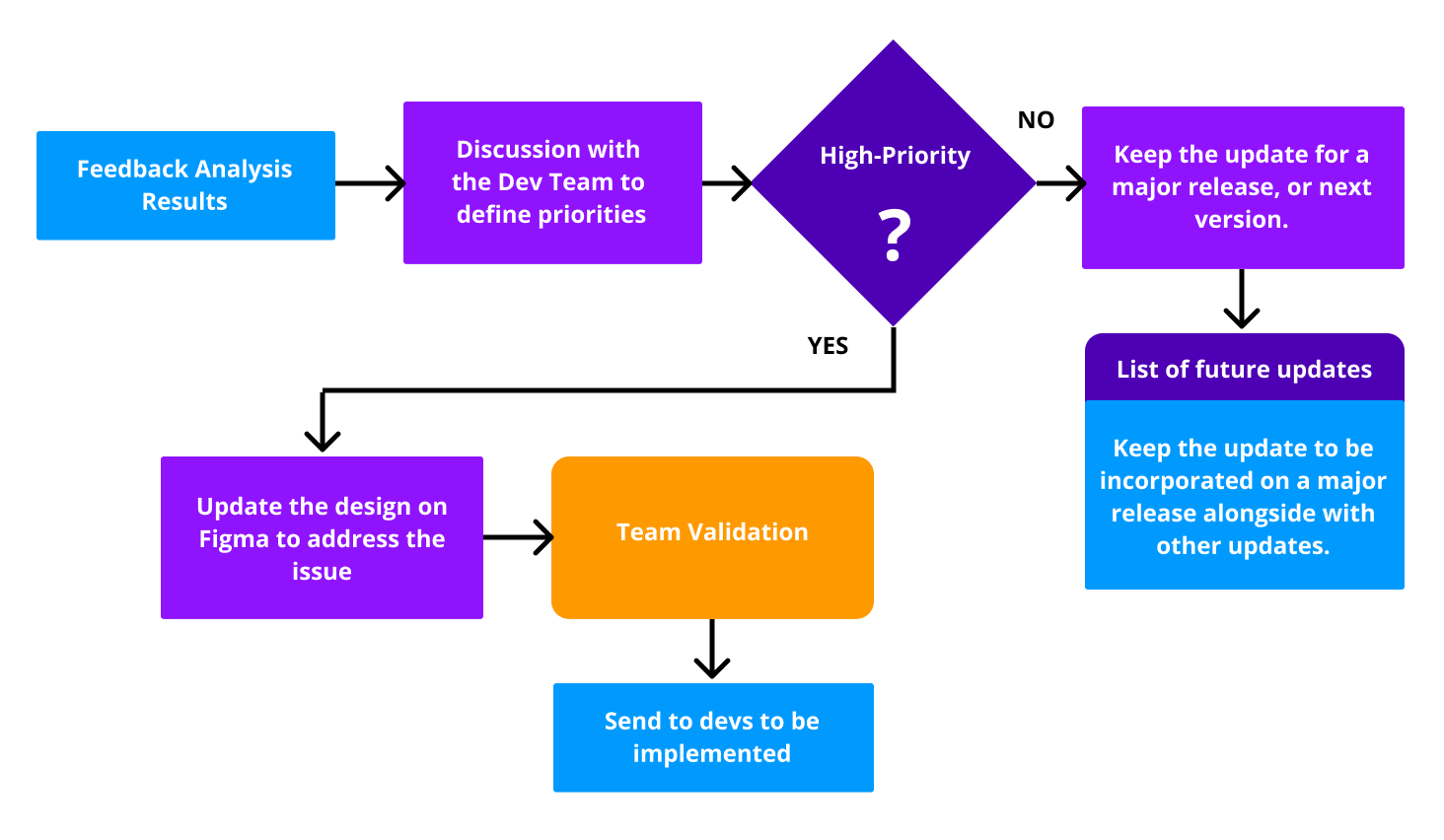
“Each design is a proposed business solution — a hypothesis. Your goal is to validate the proposed solution as efficiently as possible by using customer feedback.”
― Jeff Gothelf, Lean UX: Applying Lean Principles to Improve User Experience
Additional Activities Planned
Competitive Analysis
What is competitive analysis? A competitive analysis consists in exploring competitors’ strengths and weaknesses, to identify what they're doing right, identify gaps in the market, and opportunities to implement strategies to improve our competitive advantage.
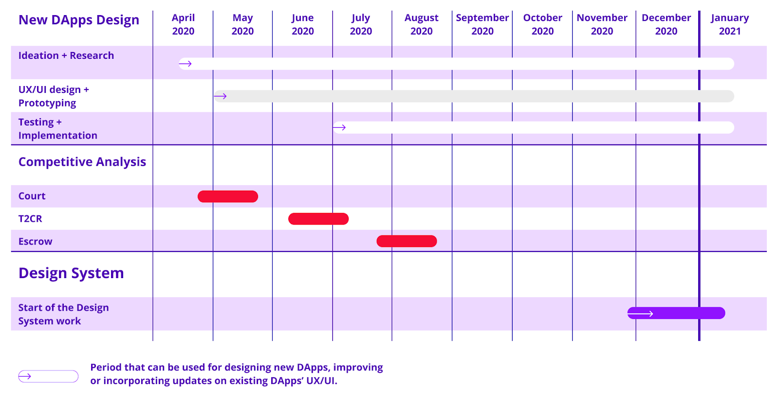
What do we plan to do? Analysis of our DApps main competitors to identify gaps in the market, strengths, weaknesses, opportunities, and threats (SWOT analysis), as well as points that we need to explore to improve our DApp UX and reach. This involves testing our competitors' products, and analysis of their strategy. Concluding the competitive analysis, we’ll also produce a detailed report with insights from the data collected.
Development of a Kleros Design System
What is a Design System? It is a collection of principles and guidelines implemented as design and code that encompasses a library of components, tools, and resources. A design system contains the building blocks that form the final product, and it is important to ensure a cohesive language, therefore facilitates the creation of new products and integrations, which avoids having to start from scratch whenever we start a new project.
Examples: IBM Carbon Design System, Rimble Design System, Aragon Design System, GitHub Primer Design System, Google Material.
Our goal is to create a Kleros design system in an effort to standardize our user experience and UI visual style, generating an open-source library of components to be used in Kleros products and by other teams in future integrations.
The Kleros design system will provide a set of components and building blocks that can be used in future DApp developments, such as footer, nav-bars, cards, buttons, etc, as well as guidelines on how to use them together in a cohesive way. It contributes to improving UI consistency and quality, making the design and development processes more efficient and focused.
Note: This is an effort that demands close collaboration from our developers to conclude, therefore we plan to start doing it from last quarter 2020 or beginning 2021. It may be postponed or advanced depending on other priority tasks.
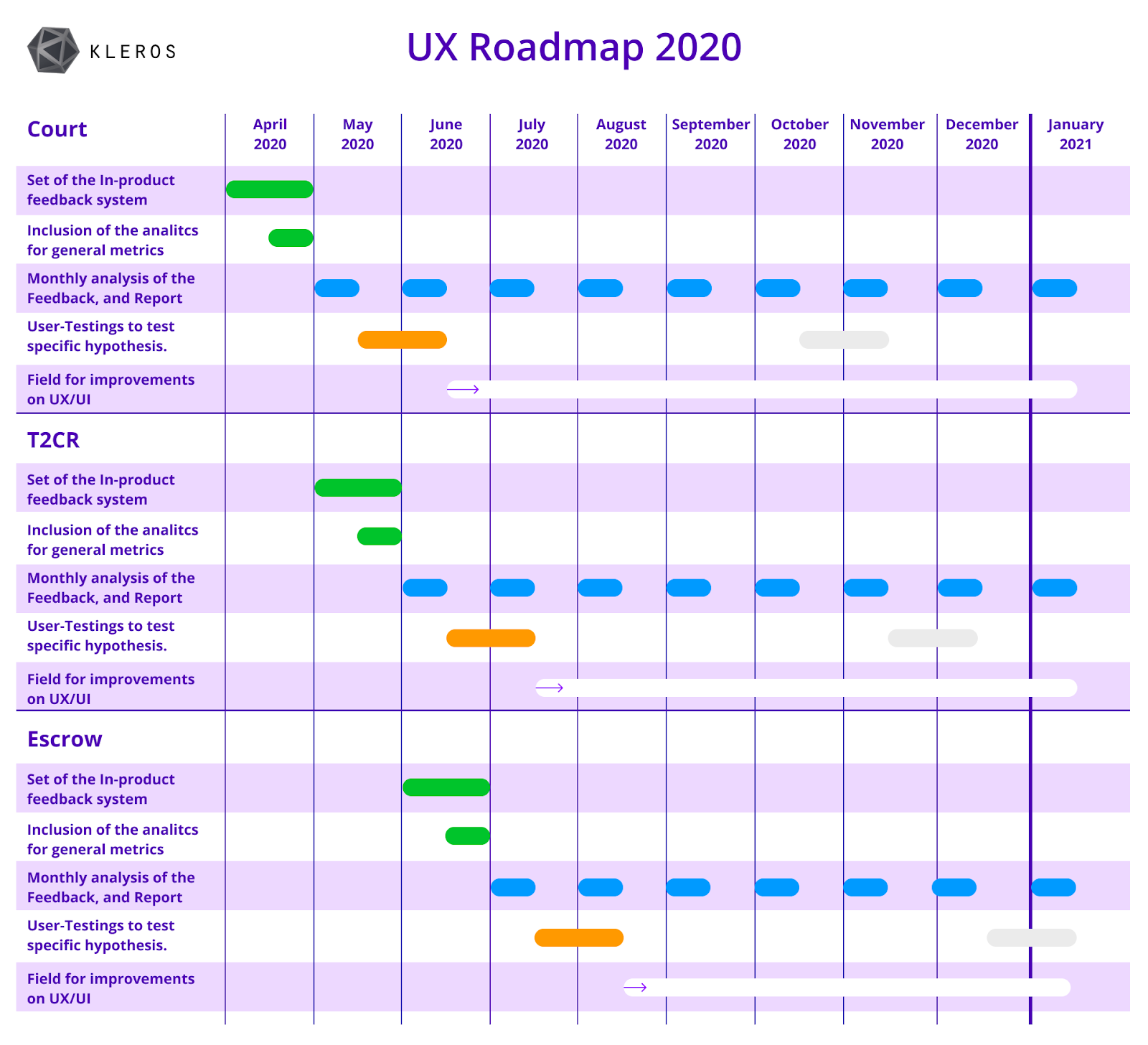
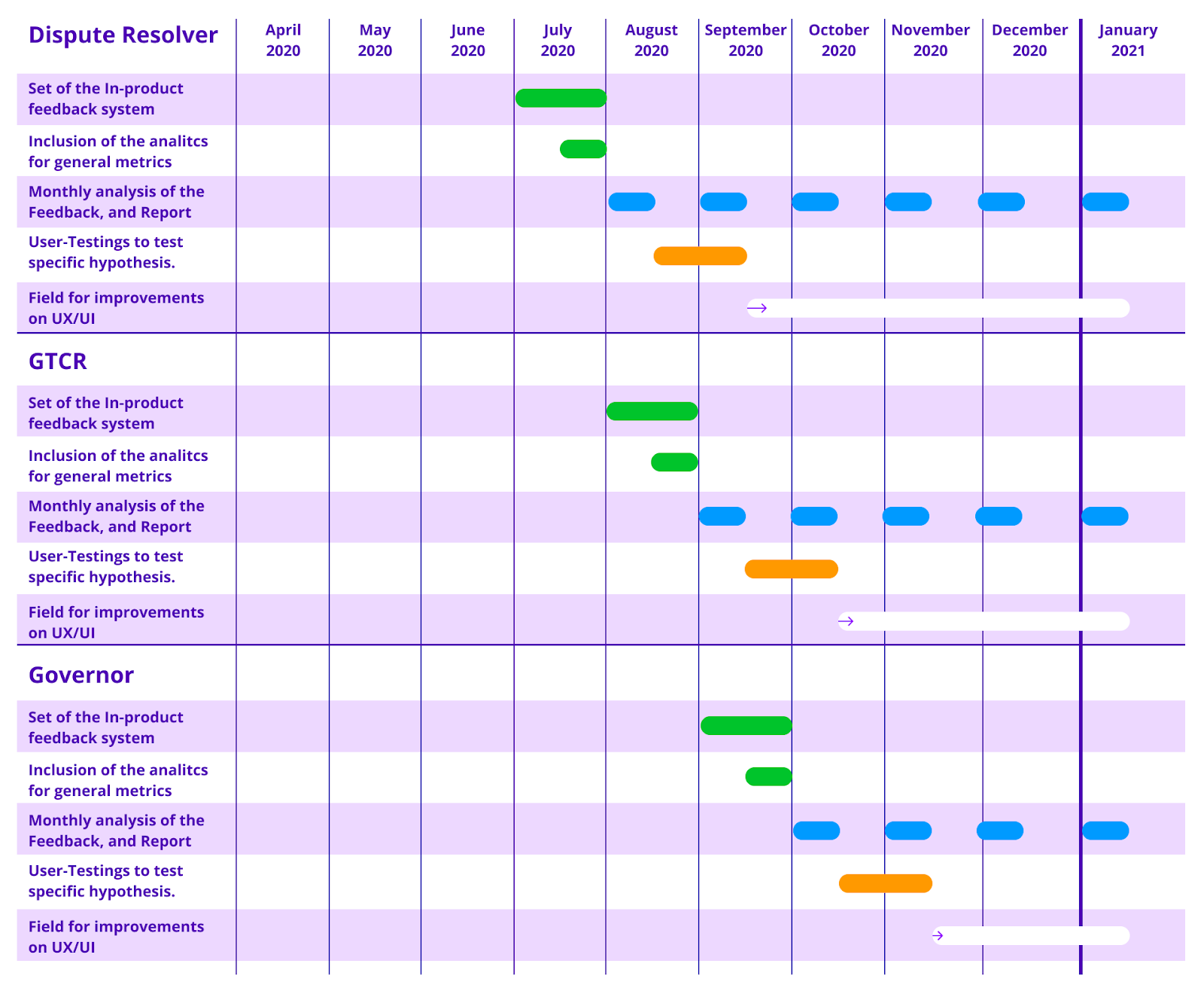
Our UX Gantt charts
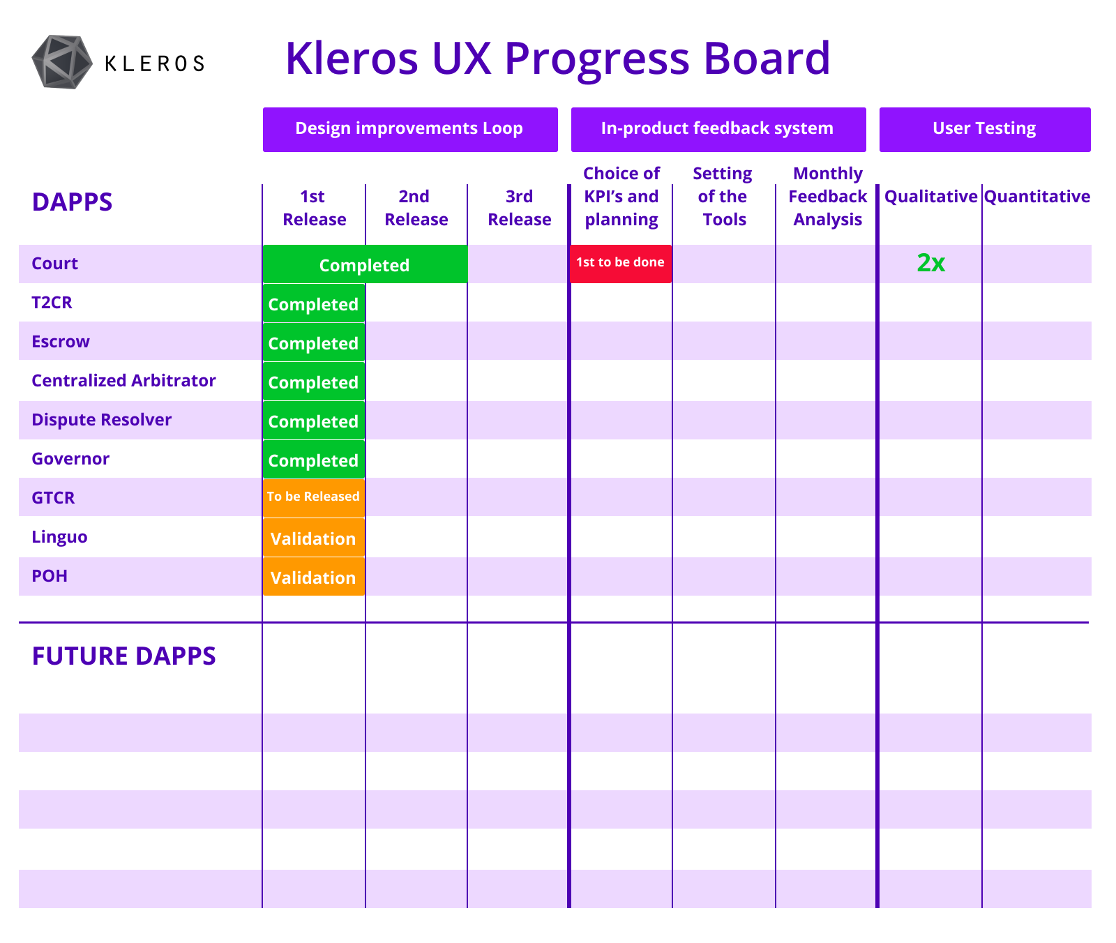
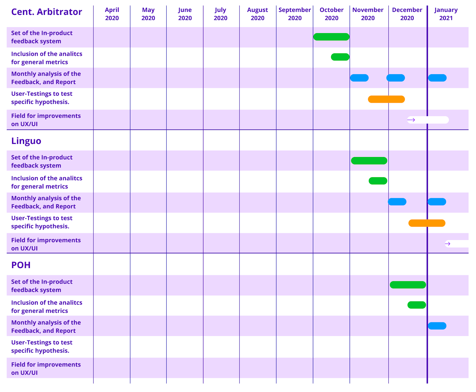
One by one, we plan to start work on the Kleros Court as our central product, then move to T2CR and Escrow, consequently the other DApps: Dispute Resolver, GTCR, Governor, Centralized Arbitrator, Linguo, POH*, as well as the upcoming ones. The data acquired monthly will help us to define what improvements to incorporate in each DApp in order to better fulfill Kleros users’ expectations.
*POH is a collaborative project, co-created by different teams and not just a Kleros project. As part of the collaboration efforts, we were responsible for the design, consequently, we plan to also track the UX metrics for this DApp.
The roadmap presents an estimation of time to start and complete each task, although it is a flexible guide that depends on other priorities that may arise along the way.
Conclusion
As we consolidate the Kleros ecosystem, which now has more than 8 products and integrations, it is becoming urgent to better track how our DApps are performing, what difficulties our users are facing and what can be done to attend their needs and increase adoption. With that effort in mind, we created this plan to structure the UX at Kleros and extract relevant feedback data from our products’ users more efficiently, thus base our future improvements on the data acquired.
Businesses at different stages have different needs, so our effort was to identify the best approach to the stage we are. Consequently, we tried to combine the best of each methodology to achieve great results from our efforts.
Considering the context involved, we decided to prioritize some UX activities at the beginning and bring our ideas to users’ eyes faster. That approach seems to have worked very well for us, although it highlights the need to give a step further on better structuring our UX research and decision-making processes.
Design Thinking has proven to work best at early stages for us especially in the brainstorming and exploratory phases. Lean UX tends to our needs very well to deliver a product fast and with quality, while Agile, as a model that encourages adaptation to respond to change and uncertainty, inspired us to keep improving our products and processes.
This combination of methods aims to empower the team to be active members throughout the entire design process contributing to a broader vision and complementing perspectives.
Further details about our strategy and process will be released soon in upcoming articles. Meanwhile, don’t forget to watch my talk at DEVCON5 in Osaka:

Where Can I Find Out More?
Join the community chat on Telegram.
Visit our website.
Follow us on Twitter.
Join our Slack for developer conversations.
Contribute on Github.
Download our Book.
