The Kleros Design System, Part 1: The Principles, Structure, and UI Library
Kleros' Design Lead, Plinio Braga presents the tenets and basic principles of the Kleros Design System.
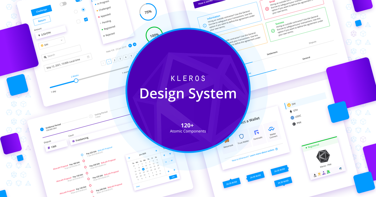
In the effort to standardize Kleros design by improving the quality of the experience offered to our community, we have created the Kleros Design System. The Kleros Design System establishes the foundations for Kleros' design as well as an important design database for future integrations.
So, What is a Design System?
A Design System is a collection of principles, components (UI Library), guidelines, and resources, created to promote a consistent experience throughout all products, thus facilitating the design, development and integration with other applications.
Design System examples: IBM Carbon Design System, Rimble Design System, GitHub Primer Design System, Google Material, Shopify Polaris.
Atomic Methodology
Based on the Atomic design methodology proposed by Brad Frost, we compiled a series of guidelines and specifications describing important aspects of the design such as color, typography, grid system, spacing system, the look, and feel, as well as a list of all elements and components used on Kleros' DApps.
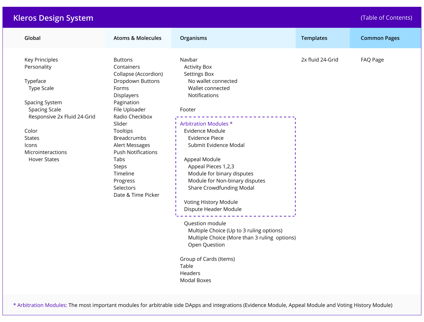
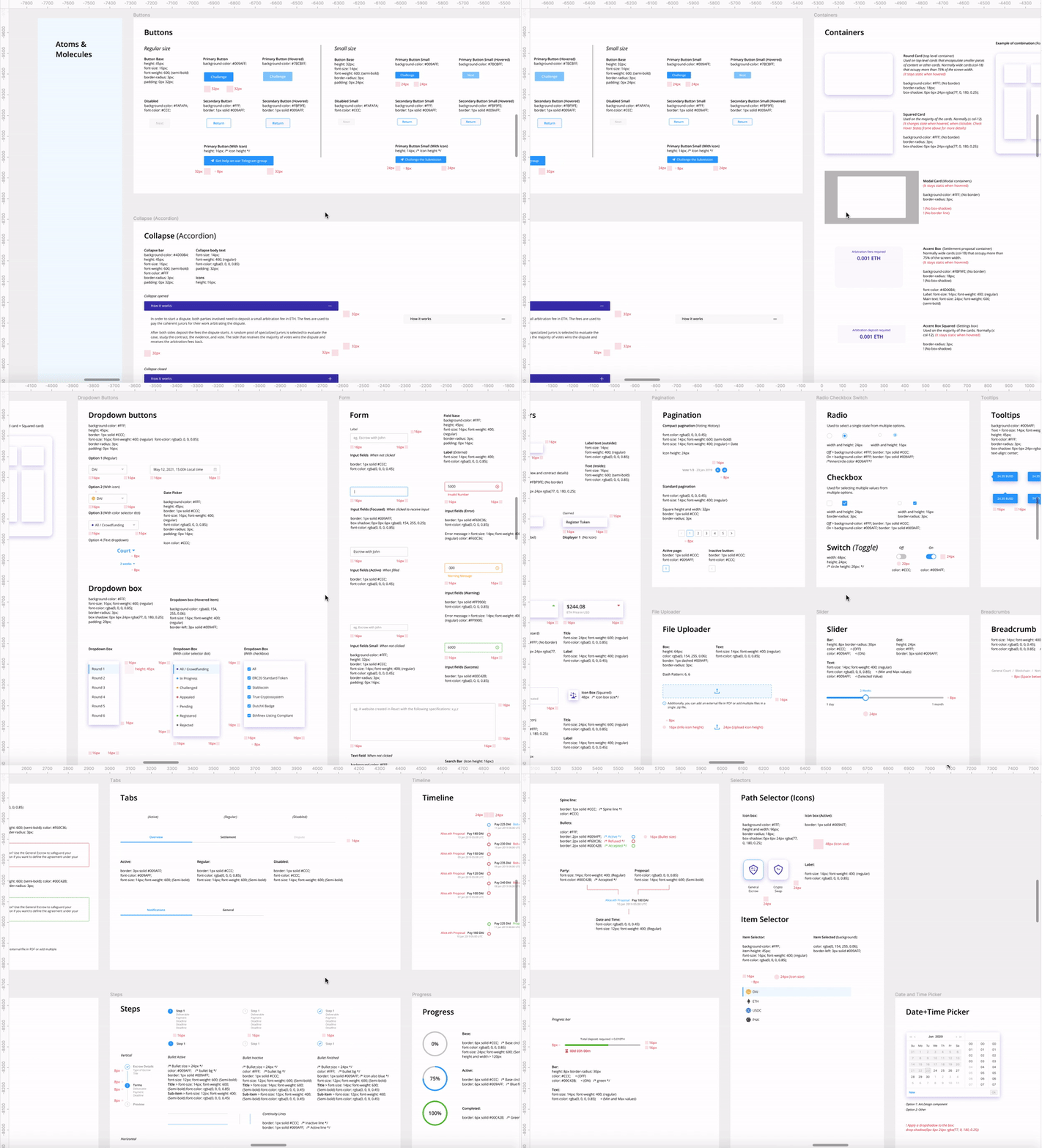
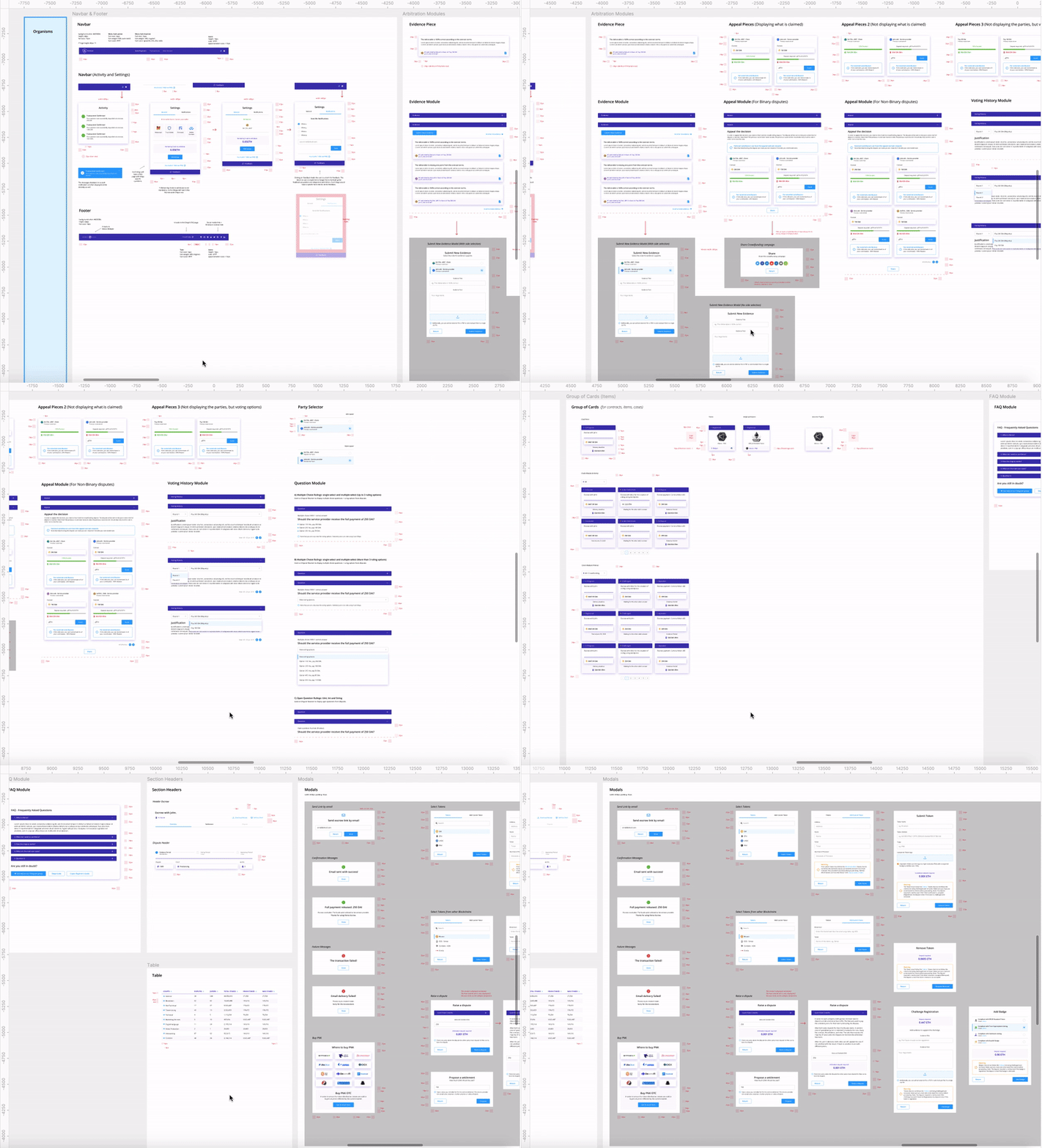
Atomic design groups the UI components into 5 distinct levels: Atoms, Molecules, Organisms, Templates, and Pages, nesting them from the smallest parts (Atoms) to the largest. This approach contributes to a systemic understanding of the design, therefore facilitating the implementation of the components. In that effort, we listed all components used in our designs including their specifications, and basic styling to guide and facilitate its use, assuring a consistent and strong experience throughout all the different solutions we propose.
The Design System
The Kleros Design System was created to reflect key principles, personality traits, and patterns; providing a cohesive language, consistent look and feel, and strong experience for all products within Kleros' ecosystem.
Key Principles
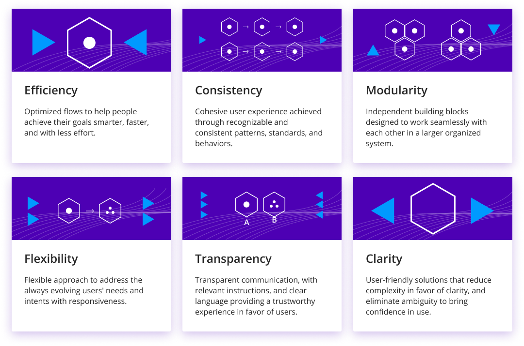
Efficiency - Optimized flows to help people achieve their goals smarter, faster, and with less effort.
Consistency - Cohesive user experience achieved through recognizable and consistent patterns, standards, and behaviors.
Modularity - Independent building blocks designed to work seamlessly with each other in a larger organized system.
Flexibility - A flexible approach to address the always evolving users' needs and intents with responsiveness.
Transparency - Transparent communication, with relevant instructions, and clear language providing a trustworthy experience in favor of users.
Clarity - User-friendly solutions that reduce complexity in favor of clarity, and eliminate ambiguity to bring confidence in use.
Personality
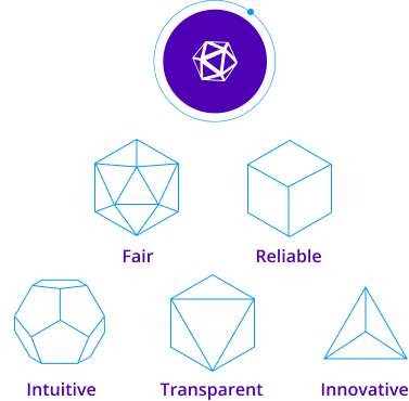
Inspired by the five platonic solids, the Kleros Design System aims to reflect five main personality traits: Fair, Reliable, Innovative, Intuitive, Transparent
Structure
The system is organized according to the following table of contents:
Typeface
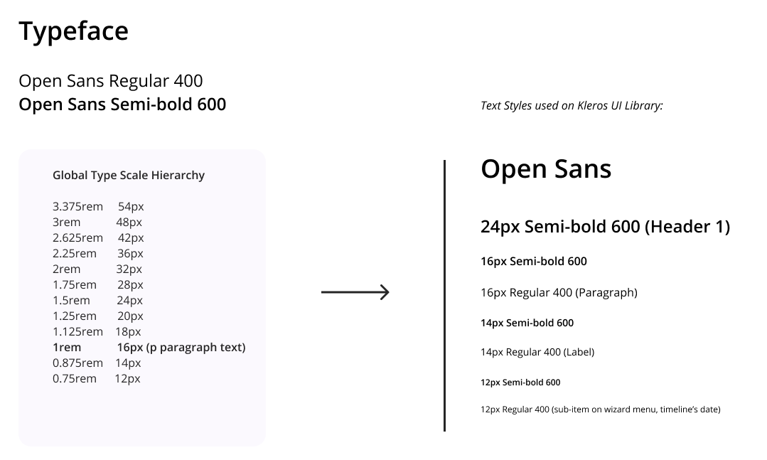
A typeface is a collection of unique letters carefully selected to work in perfect balance together. In essence, it represents the patterns which provide style, legibility and meaning to the design. It establishes a visual hierarchy, organizes information and facilitates readability.
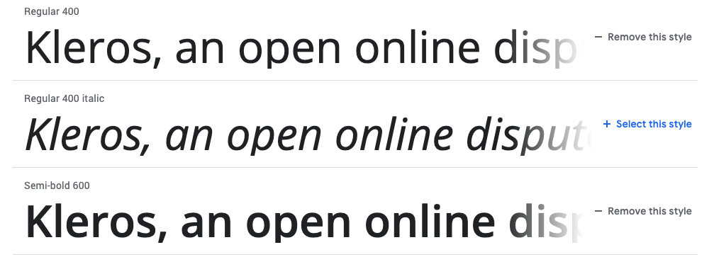
The Kleros Design System uses a google-font called Open Sans, which is a humanist sans-serif typeface designed by Steve Matteson. The font brings a neutral sense, yet friendly, and it has excellent legibility on screen and at small sizes. The Kleros Design System uses the Open Sans in two main weights: (Regular 400), and (Semi-bold 600).
Spacing System
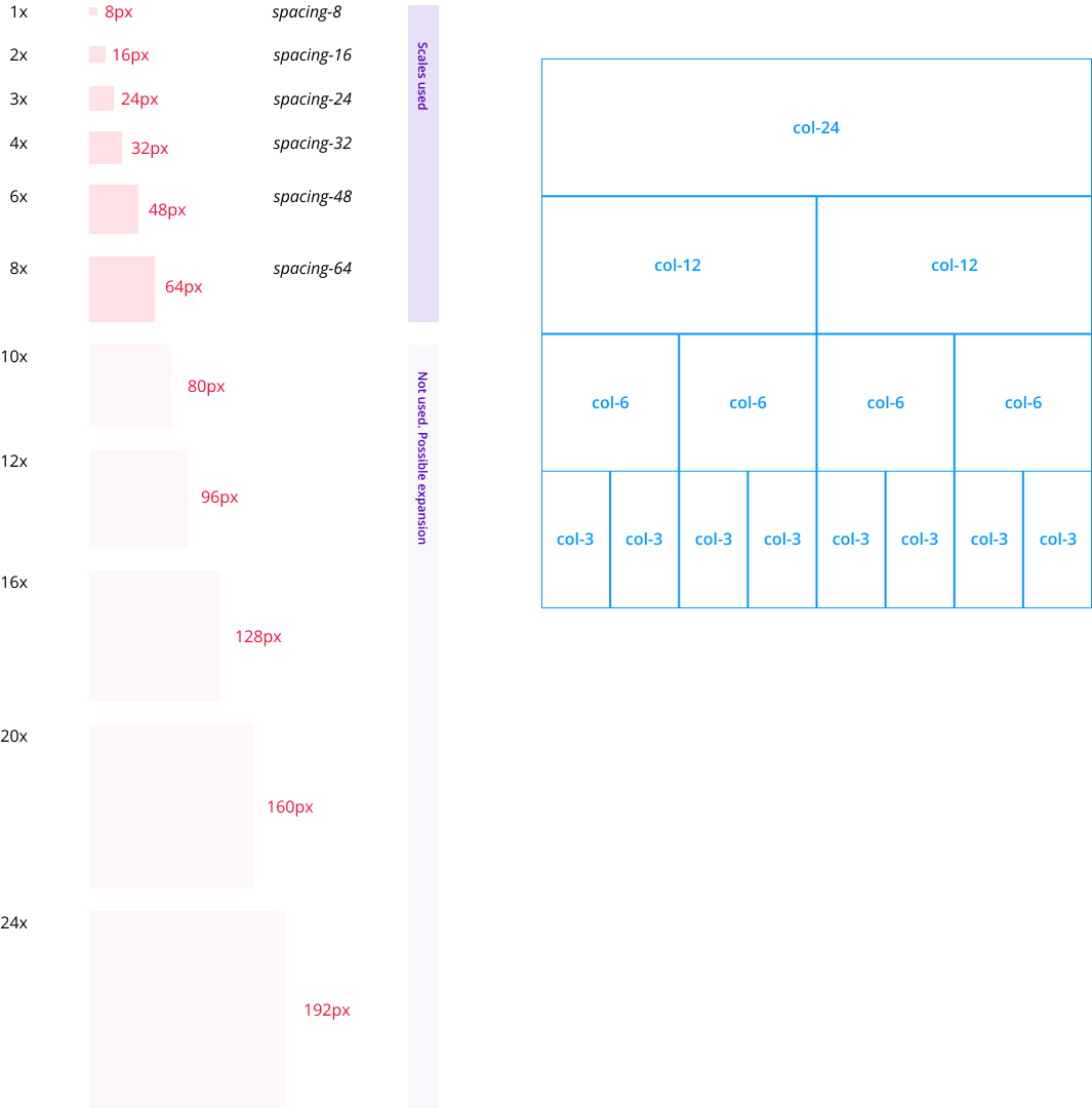
As important as the visual parts of the design (form), are the blank spaces between elements (counter-form). Also referred to as negative spaces, the counter-form is vital to create harmony and a sense of fluidity, enhancing parts of the design according to its use.
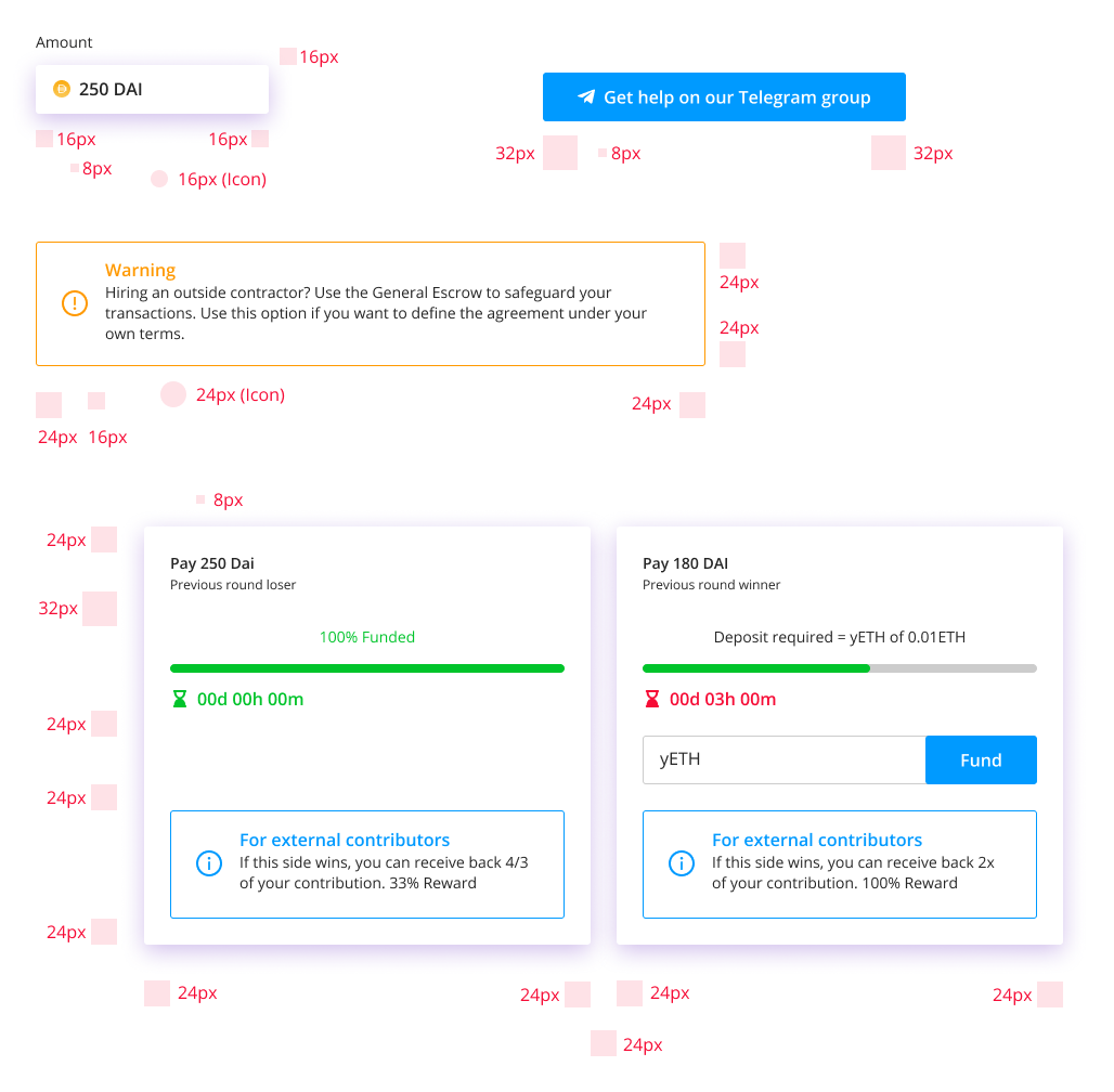
In order to structure the use of spacing throughout the design we created a spacing scale based on the 8px unit. The spacing scale is widely used for sizing icons, components’ paddings, and applying vertical margin space, assuring the consistent, fluid, and predictable use of spacing throughout all the solutions. All the numbers are multiples of 8.
Responsive 2x Fluid 24-Grid - For horizontal alignment we rely on a Responsive 2x Fluid 24-Grid. On a fluid grid the container width adapts as the screen size changes.
Colors
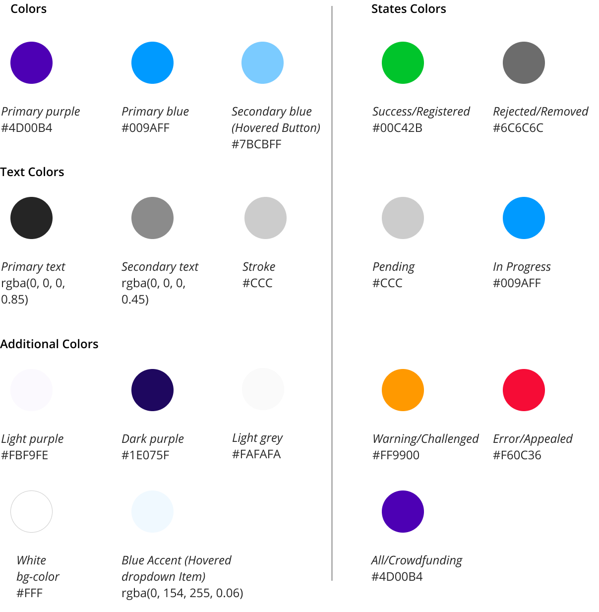
Purple at the core, blue on details. Purple (#4D00B4) is the main color in Kleros' visual identity. The purple color is often associated with wisdom, independence, and uniqueness, evoking a calm state of mind, necessary to evaluate the disputes with discernment, impartiality, and confidence.
Atoms & Molecules
Organisms
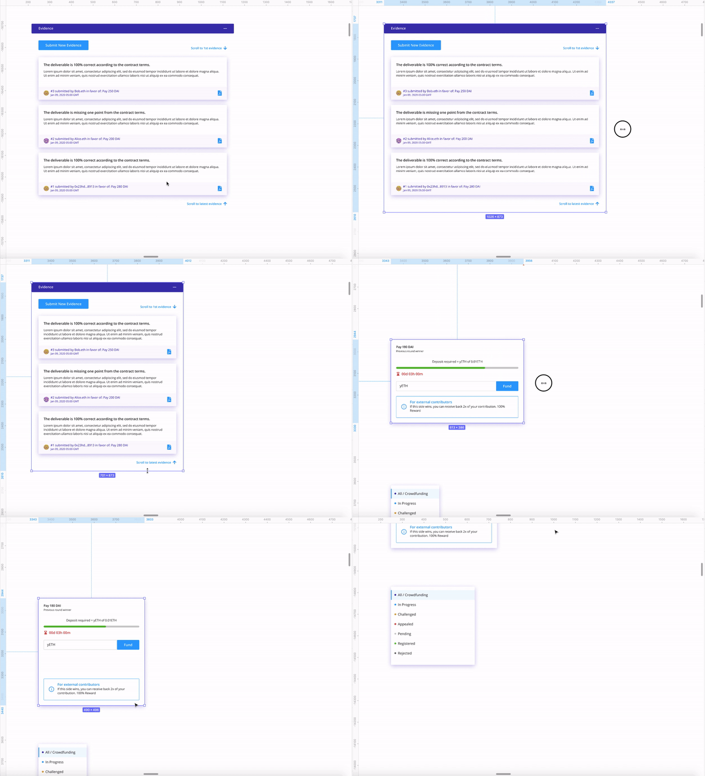
Constraints and Responsive Behavior
With the configuration of constraints on Figma, we simulate how objects should respond when resized. This indicates how the components look across different screen sizes and devices.
Key Modules for Integrations (Arbitrable Side DApps)
The Kleros ecosystem gravitates around the Kleros Court (Arbitrator Side), where jurors resolve disputes originated in several other DApps (Arbitrable Side). Applications wanting to make use of Kleros' dispute resolution can take advantage of 3 key modules to allow that, which are:
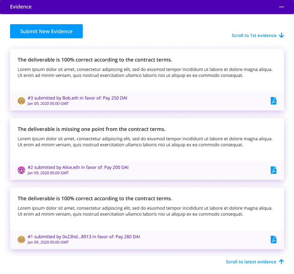
1. Evidence Module. This module allows users to add evidence as well as visualize all the evidence involved in a dispute.
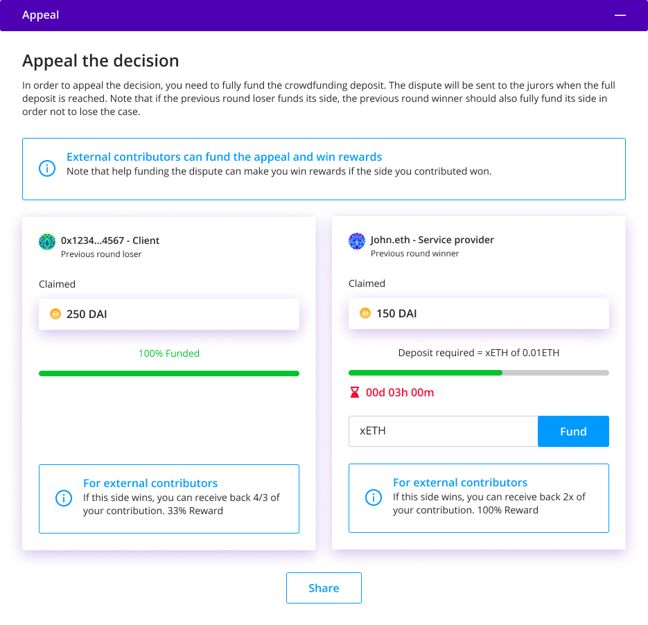
2. Appeal Module. This module allows users to appeal a decision made by jurors, starting a new round.
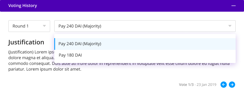
3. Voting History Module. This module allows users to visualize previous rounds decisions: What ruling option achieved the majority of votes, how jurors voted before, and its justifications (if they have them), in order to better inform themselves about if an appeal is worthy. (Normally it comes along with the Appeal Module).
These modules are the most important parts needed to integrate the Kleros dispute resolution process into an arbitrable side DApp. Considering the diverse applications integrated with Kleros at the moment, these parts are present in the majority of them.
A few variations of these modules are present on the Design System, to attend a higher number of applications. As an example, we have an Appeal Module specific for binary disputes (multiple choice with 2 ruling options), an Appeal Module specific for non-binary disputes (multiple choice with more than 2 ruling options) and an Appeal Module specific for non-binary disputes (open question), to be used according to the use case.
These, as well as other variations of the same components can be found in the design, taking into consideration the needs of different use cases we've been experiencing in the last years.
Another component present in most arbitrable side DApps is the (Dispute Header). It basically informs the users at which stage of the arbitration process the dispute is, the number of the dispute on Kleros Court, which court it belongs to, as well as the number of jurors that are evaluating the case.

“Design systems are always evolving, and the way you share and encourage adoption of new iterations will evolve along the way as well.”
–Diana Mounter, Design Systems Manager at GitHub
What stage are we in?
The design phase has concluded generating detailed design documentation on Figma meant to guide designers and developers on the proper application of the patterns, components, and experiences proposed, therefore fostering quality integrations, and new developments with ease. We have been introducing its new components on new versions of some DApps already, (some of them in implementation phase), such as the Escrow 2.0, Escrow Widget, Dispute Resolver, Governor and the T2CR.
The implementation and documentation phase is also concluding. The Kleros Design System can be easily theme-able according to the use cases it's been applied to. That facilitates the integration of the components with the visual identity of our partners—respecting the needs of each integration proposal. The library’s developments in Ethereum declarative data management will be useful for all crypto projects.
In the Design System article Part 2, we dive into the implementation and documentation of Kleros Design System. Stay tuned!

Where Can I Find Out More?
Join the community chat on Telegram.
Visit our website.
Follow us on Twitter.
Join our Slack for developer conversations.
Contribute on Github.
Download our Book
